46. Simple Linear Regression Model#
import numpy as np
import pandas as pd
import matplotlib.pyplot as plt
The simple regression model estimates the relationship between two variables \(x_i\) and \(y_i\)
where \(\epsilon_i\) represents the error between the line of best fit and the sample values for \(y_i\) given \(x_i\).
Our goal is to choose values for \(\alpha\) and \(\beta\) to build a line of “best” fit for some data that is available for variables \(x_i\) and \(y_i\).
Let us consider a simple dataset of 10 observations for variables \(x_i\) and \(y_i\):
\(y_i\) |
\(x_i\) |
|
|---|---|---|
1 |
2000 |
32 |
2 |
1000 |
21 |
3 |
1500 |
24 |
4 |
2500 |
35 |
5 |
500 |
10 |
6 |
900 |
11 |
7 |
1100 |
22 |
8 |
1500 |
21 |
9 |
1800 |
27 |
10 |
250 |
2 |
Let us think about \(y_i\) as sales for an ice-cream cart, while \(x_i\) is a variable that records the day’s temperature in Celsius.
x = [32, 21, 24, 35, 10, 11, 22, 21, 27, 2]
y = [2000,1000,1500,2500,500,900,1100,1500,1800, 250]
df = pd.DataFrame([x,y]).T
df.columns = ['X', 'Y']
df
| X | Y | |
|---|---|---|
| 0 | 32 | 2000 |
| 1 | 21 | 1000 |
| 2 | 24 | 1500 |
| 3 | 35 | 2500 |
| 4 | 10 | 500 |
| 5 | 11 | 900 |
| 6 | 22 | 1100 |
| 7 | 21 | 1500 |
| 8 | 27 | 1800 |
| 9 | 2 | 250 |
We can use a scatter plot of the data to see the relationship between \(y_i\) (ice-cream sales in dollars ($’s)) and \(x_i\) (degrees Celsius).
ax = df.plot(
    x='X',
    y='Y',
    kind='scatter',
    ylabel='Ice-cream sales ($\'s)',
    xlabel='Degrees Celsius'
)
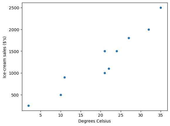
Fig. 46.1 Scatter plot#
as you can see the data suggests that more ice-cream is typically sold on hotter days.
To build a linear model of the data we need to choose values for \(\alpha\) and \(\beta\) that represents a line of “best” fit such that
Let’s start with \(\alpha = 5\) and \(\beta = 10\)
α = 5
β = 10
df['Y_hat'] = α + β * df['X']
fig, ax = plt.subplots()
ax = df.plot(x='X',y='Y', kind='scatter', ax=ax)
ax = df.plot(x='X',y='Y_hat', kind='line', ax=ax)
plt.show()
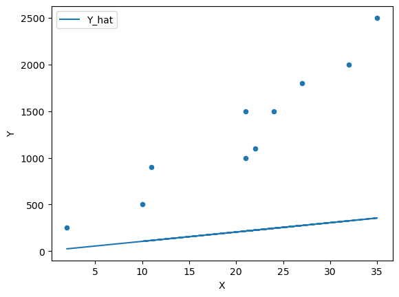
Fig. 46.2 Scatter plot with a line of fit#
We can see that this model does a poor job of estimating the relationship.
We can continue to guess and iterate towards a line of “best” fit by adjusting the parameters
β = 100
df['Y_hat'] = α + β * df['X']
fig, ax = plt.subplots()
ax = df.plot(x='X',y='Y', kind='scatter', ax=ax)
ax = df.plot(x='X',y='Y_hat', kind='line', ax=ax)
plt.show()
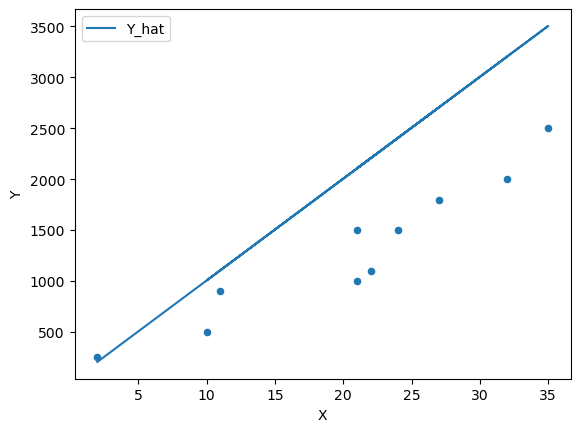
Fig. 46.3 Scatter plot with a line of fit #2#
β = 65
df['Y_hat'] = α + β * df['X']
fig, ax = plt.subplots()
ax = df.plot(x='X',y='Y', kind='scatter', ax=ax)
ax = df.plot(x='X',y='Y_hat', kind='line', ax=ax, color='g')
plt.show()
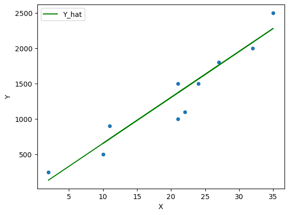
Fig. 46.4 Scatter plot with a line of fit #3#
However we need to think about formalizing this guessing process by thinking of this problem as an optimization problem.
Let’s consider the error \(\epsilon_i\) and define the difference between the observed values \(y_i\) and the estimated values \(\hat{y}_i\) which we will call the residuals
df['error'] = df['Y_hat'] - df['Y']
df
| X | Y | Y_hat | error | |
|---|---|---|---|---|
| 0 | 32 | 2000 | 2085 | 85 |
| 1 | 21 | 1000 | 1370 | 370 |
| 2 | 24 | 1500 | 1565 | 65 |
| 3 | 35 | 2500 | 2280 | -220 |
| 4 | 10 | 500 | 655 | 155 |
| 5 | 11 | 900 | 720 | -180 |
| 6 | 22 | 1100 | 1435 | 335 |
| 7 | 21 | 1500 | 1370 | -130 |
| 8 | 27 | 1800 | 1760 | -40 |
| 9 | 2 | 250 | 135 | -115 |
fig, ax = plt.subplots()
ax = df.plot(x='X',y='Y', kind='scatter', ax=ax)
ax = df.plot(x='X',y='Y_hat', kind='line', ax=ax, color='g')
plt.vlines(df['X'], df['Y_hat'], df['Y'], color='r')
plt.show()

Fig. 46.5 Plot of the residuals#
The Ordinary Least Squares (OLS) method chooses \(\alpha\) and \(\beta\) in such a way that minimizes the sum of the squared residuals (SSR).
Let’s call this a cost function
that we would like to minimize with parameters \(\alpha\) and \(\beta\).
46.1. How does error change with respect to \(\alpha\) and \(\beta\)#
Let us first look at how the total error changes with respect to \(\beta\) (holding the intercept \(\alpha\) constant)
We know from the next section the optimal values for \(\alpha\) and \(\beta\) are:
β_optimal = 64.38
α_optimal = -14.72
We can then calculate the error for a range of \(\beta\) values
errors = {}
for β in np.arange(20,100,0.5):
    errors[β] = abs((α_optimal + β * df['X']) - df['Y']).sum()
Plotting the error
ax = pd.Series(errors).plot(xlabel='β', ylabel='error')
plt.axvline(β_optimal, color='r');
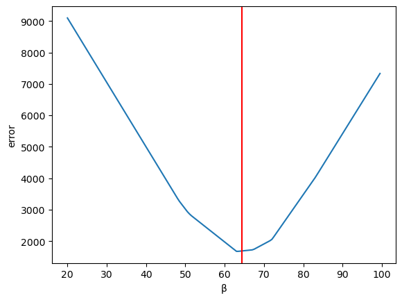
Fig. 46.6 Plotting the error#
Now let us vary \(\alpha\) (holding \(\beta\) constant)
errors = {}
for α in np.arange(-500,500,5):
    errors[α] = abs((α + β_optimal * df['X']) - df['Y']).sum()
Plotting the error
ax = pd.Series(errors).plot(xlabel='α', ylabel='error')
plt.axvline(α_optimal, color='r');
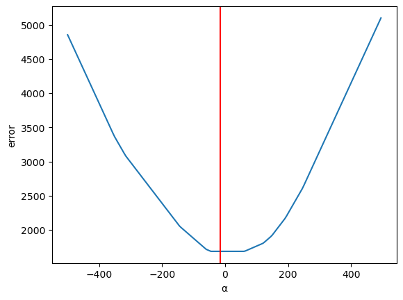
Fig. 46.7 Plotting the error (2)#
46.2. Calculating optimal values#
Now let us use calculus to solve the optimization problem and compute the optimal values for \(\alpha\) and \(\beta\) to find the ordinary least squares solution.
First taking the partial derivative with respect to \(\alpha\)
and setting it equal to \(0\)
we can remove the constant \(-2\) from the summation by dividing both sides by \(-2\)
Now we can split this equation up into the components
The middle term is a straightforward sum from \(i=1,...N\) by a constant \(\alpha\)
and rearranging terms
We observe that both fractions resolve to the means \(\bar{y_i}\) and \(\bar{x_i}\)
Now let’s take the partial derivative of the cost function \(C\) with respect to \(\beta\)
and setting it equal to \(0\)
we can again take the constant outside of the summation and divide both sides by \(-2\)
which becomes
now substituting for \(\alpha\)
and rearranging terms
This can be split into two summations
and solving for \(\beta\) yields
We can now use (46.1) and (46.2) to calculate the optimal values for \(\alpha\) and \(\beta\)
Calculating \(\beta\)
df = df[['X','Y']].copy()  # Original Data

# Calculate the sample means
x_bar = df['X'].mean()
y_bar = df['Y'].mean()
Now computing across the 10 observations and then summing the numerator and denominator
# Compute the Sums
df['num'] = df['X'] * df['Y'] - y_bar * df['X']
df['den'] = pow(df['X'],2) - x_bar * df['X']
β = df['num'].sum() / df['den'].sum()
print(β)
64.37665782493369
Calculating \(\alpha\)
α = y_bar - β * x_bar
print(α)
-14.72148541114052
Now we can plot the OLS solution
df['Y_hat'] = α + β * df['X']
df['error'] = df['Y_hat'] - df['Y']

fig, ax = plt.subplots()
ax = df.plot(x='X',y='Y', kind='scatter', ax=ax)
ax = df.plot(x='X',y='Y_hat', kind='line', ax=ax, color='g')
plt.vlines(df['X'], df['Y_hat'], df['Y'], color='r');
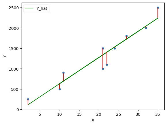
Fig. 46.8 OLS line of best fit#
Exercise 46.1
Now that you know the equations that solve the simple linear regression model using OLS you can now run your own regressions to build a model between \(y\) and \(x\).
Let’s consider two economic variables GDP per capita and Life Expectancy.
What do you think their relationship would be?
Gather some data from our world in data
Use
pandasto import thecsvformatted data and plot a few different countries of interestUse (46.1) and (46.2) to compute optimal values for \(\alpha\) and \(\beta\)
Plot the line of best fit found using OLS
Interpret the coefficients and write a summary sentence of the relationship between GDP per capita and Life Expectancy
Solution to Exercise 46.1
Q2: Gather some data from our world in data
You can download a copy of the data here if you get stuck
Q3: Use pandas to import the csv formatted data and plot a few different countries of interest
data_url = "https://github.com/QuantEcon/lecture-python-intro/raw/main/lectures/_static/lecture_specific/simple_linear_regression/life-expectancy-vs-gdp-per-capita.csv"
df = pd.read_csv(data_url, nrows=10)
df
| Entity | Code | Year | Life expectancy at birth (historical) | GDP per capita | 417485-annotations | Population (historical estimates) | Continent | |
|---|---|---|---|---|---|---|---|---|
| 0 | Abkhazia | OWID_ABK | 2015 | NaN | NaN | NaN | NaN | Asia |
| 1 | Afghanistan | AFG | 1950 | 27.7 | 1156.0 | NaN | 7480464.0 | NaN |
| 2 | Afghanistan | AFG | 1951 | 28.0 | 1170.0 | NaN | 7571542.0 | NaN |
| 3 | Afghanistan | AFG | 1952 | 28.4 | 1189.0 | NaN | 7667534.0 | NaN |
| 4 | Afghanistan | AFG | 1953 | 28.9 | 1240.0 | NaN | 7764549.0 | NaN |
| 5 | Afghanistan | AFG | 1954 | 29.2 | 1245.0 | NaN | 7864289.0 | NaN |
| 6 | Afghanistan | AFG | 1955 | 29.9 | 1246.0 | NaN | 7971933.0 | NaN |
| 7 | Afghanistan | AFG | 1956 | 30.4 | 1278.0 | NaN | 8087730.0 | NaN |
| 8 | Afghanistan | AFG | 1957 | 30.9 | 1253.0 | NaN | 8210207.0 | NaN |
| 9 | Afghanistan | AFG | 1958 | 31.5 | 1298.0 | NaN | 8333827.0 | NaN |
You can see that the data downloaded from Our World in Data has provided a global set of countries with the GDP per capita and Life Expectancy Data.
It is often a good idea to at first import a few lines of data from a csv to understand its structure so that you can then choose the columns that you want to read into your DataFrame.
You can observe that there are a bunch of columns we won’t need to import such as Continent
So let’s build a list of the columns we want to import
cols = ['Code', 'Year', 'Life expectancy at birth (historical)', 'GDP per capita']
df = pd.read_csv(data_url, usecols=cols)
df
| Code | Year | Life expectancy at birth (historical) | GDP per capita | |
|---|---|---|---|---|
| 0 | OWID_ABK | 2015 | NaN | NaN |
| 1 | AFG | 1950 | 27.7 | 1156.0 |
| 2 | AFG | 1951 | 28.0 | 1170.0 |
| 3 | AFG | 1952 | 28.4 | 1189.0 |
| 4 | AFG | 1953 | 28.9 | 1240.0 |
| ... | ... | ... | ... | ... |
| 62151 | ZWE | 1946 | NaN | NaN |
| 62152 | ZWE | 1947 | NaN | NaN |
| 62153 | ZWE | 1948 | NaN | NaN |
| 62154 | ZWE | 1949 | NaN | NaN |
| 62155 | ALA | 2015 | NaN | NaN |
62156 rows × 4 columns
Sometimes it can be useful to rename your columns to make it easier to work with in the DataFrame
df.columns = ["cntry", "year", "life_expectancy", "gdppc"]
df
| cntry | year | life_expectancy | gdppc | |
|---|---|---|---|---|
| 0 | OWID_ABK | 2015 | NaN | NaN |
| 1 | AFG | 1950 | 27.7 | 1156.0 |
| 2 | AFG | 1951 | 28.0 | 1170.0 |
| 3 | AFG | 1952 | 28.4 | 1189.0 |
| 4 | AFG | 1953 | 28.9 | 1240.0 |
| ... | ... | ... | ... | ... |
| 62151 | ZWE | 1946 | NaN | NaN |
| 62152 | ZWE | 1947 | NaN | NaN |
| 62153 | ZWE | 1948 | NaN | NaN |
| 62154 | ZWE | 1949 | NaN | NaN |
| 62155 | ALA | 2015 | NaN | NaN |
62156 rows × 4 columns
We can see there are NaN values which represent missing data so let us go ahead and drop those
df.dropna(inplace=True)
df
| cntry | year | life_expectancy | gdppc | |
|---|---|---|---|---|
| 1 | AFG | 1950 | 27.7 | 1156.0000 |
| 2 | AFG | 1951 | 28.0 | 1170.0000 |
| 3 | AFG | 1952 | 28.4 | 1189.0000 |
| 4 | AFG | 1953 | 28.9 | 1240.0000 |
| 5 | AFG | 1954 | 29.2 | 1245.0000 |
| ... | ... | ... | ... | ... |
| 61960 | ZWE | 2014 | 58.8 | 1594.0000 |
| 61961 | ZWE | 2015 | 59.6 | 1560.0000 |
| 61962 | ZWE | 2016 | 60.3 | 1534.0000 |
| 61963 | ZWE | 2017 | 60.7 | 1582.3662 |
| 61964 | ZWE | 2018 | 61.4 | 1611.4052 |
12445 rows × 4 columns
We have now dropped the number of rows in our DataFrame from 62156 to 12445 removing a lot of empty data relationships.
Now we have a dataset containing life expectancy and GDP per capita for a range of years.
It is always a good idea to spend a bit of time understanding what data you actually have.
For example, you may want to explore this data to see if there is consistent reporting for all countries across years
Let’s first look at the Life Expectancy Data
le_years = df[['cntry', 'year', 'life_expectancy']].set_index(['cntry', 'year']).unstack()['life_expectancy']
le_years
| year | 1543 | 1548 | 1553 | 1558 | 1563 | 1568 | 1573 | 1578 | 1583 | 1588 | ... | 2009 | 2010 | 2011 | 2012 | 2013 | 2014 | 2015 | 2016 | 2017 | 2018 |
|---|---|---|---|---|---|---|---|---|---|---|---|---|---|---|---|---|---|---|---|---|---|
| cntry | |||||||||||||||||||||
| AFG | NaN | NaN | NaN | NaN | NaN | NaN | NaN | NaN | NaN | NaN | ... | 60.4 | 60.9 | 61.4 | 61.9 | 62.4 | 62.5 | 62.7 | 63.1 | 63.0 | 63.1 |
| AGO | NaN | NaN | NaN | NaN | NaN | NaN | NaN | NaN | NaN | NaN | ... | 55.8 | 56.7 | 57.6 | 58.6 | 59.3 | 60.0 | 60.7 | 61.1 | 61.7 | 62.1 |
| ALB | NaN | NaN | NaN | NaN | NaN | NaN | NaN | NaN | NaN | NaN | ... | 77.8 | 77.9 | 78.1 | 78.1 | 78.1 | 78.4 | 78.6 | 78.9 | 79.0 | 79.2 |
| ARE | NaN | NaN | NaN | NaN | NaN | NaN | NaN | NaN | NaN | NaN | ... | 78.0 | 78.3 | 78.5 | 78.7 | 78.9 | 79.0 | 79.2 | 79.3 | 79.5 | 79.6 |
| ARG | NaN | NaN | NaN | NaN | NaN | NaN | NaN | NaN | NaN | NaN | ... | 75.9 | 75.7 | 76.1 | 76.5 | 76.5 | 76.8 | 76.8 | 76.3 | 76.8 | 77.0 |
| ... | ... | ... | ... | ... | ... | ... | ... | ... | ... | ... | ... | ... | ... | ... | ... | ... | ... | ... | ... | ... | ... |
| VNM | NaN | NaN | NaN | NaN | NaN | NaN | NaN | NaN | NaN | NaN | ... | 73.5 | 73.5 | 73.7 | 73.7 | 73.8 | 73.9 | 73.9 | 73.9 | 74.0 | 74.0 |
| YEM | NaN | NaN | NaN | NaN | NaN | NaN | NaN | NaN | NaN | NaN | ... | 67.2 | 67.3 | 67.4 | 67.3 | 67.5 | 67.4 | 65.9 | 66.1 | 66.0 | 64.6 |
| ZAF | NaN | NaN | NaN | NaN | NaN | NaN | NaN | NaN | NaN | NaN | ... | 57.4 | 58.9 | 60.7 | 61.8 | 62.5 | 63.4 | 63.9 | 64.7 | 65.4 | 65.7 |
| ZMB | NaN | NaN | NaN | NaN | NaN | NaN | NaN | NaN | NaN | NaN | ... | 55.3 | 56.8 | 57.8 | 58.9 | 59.9 | 60.7 | 61.2 | 61.8 | 62.1 | 62.3 |
| ZWE | NaN | NaN | NaN | NaN | NaN | NaN | NaN | NaN | NaN | NaN | ... | 48.1 | 50.7 | 53.3 | 55.6 | 57.5 | 58.8 | 59.6 | 60.3 | 60.7 | 61.4 |
166 rows × 310 columns
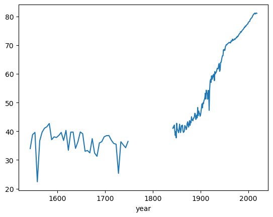
As you can see there are a lot of countries where data is not available for the Year 1543!
Which country does report this data?
le_years[~le_years[1543].isna()]
| year | 1543 | 1548 | 1553 | 1558 | 1563 | 1568 | 1573 | 1578 | 1583 | 1588 | ... | 2009 | 2010 | 2011 | 2012 | 2013 | 2014 | 2015 | 2016 | 2017 | 2018 |
|---|---|---|---|---|---|---|---|---|---|---|---|---|---|---|---|---|---|---|---|---|---|
| cntry | |||||||||||||||||||||
| GBR | 33.94 | 38.82 | 39.59 | 22.38 | 36.66 | 39.67 | 41.06 | 41.56 | 42.7 | 37.05 | ... | 80.2 | 80.4 | 80.8 | 80.9 | 80.9 | 81.2 | 80.9 | 81.1 | 81.2 | 81.1 |
1 rows × 310 columns
You can see that Great Britain (GBR) is the only one available
You can also take a closer look at the time series to find that it is also non-continuous, even for GBR.
le_years.loc['GBR'].plot()
<Axes: xlabel='year'>
In fact we can use pandas to quickly check how many countries are captured in each year
le_years.stack().unstack(level=0).count(axis=1).plot(xlabel="Year", ylabel="Number of countries");
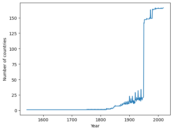
So it is clear that if you are doing cross-sectional comparisons then more recent data will include a wider set of countries
Now let us consider the most recent year in the dataset 2018
df = df[df.year == 2018].reset_index(drop=True).copy()
df.plot(x='gdppc', y='life_expectancy', kind='scatter', xlabel="GDP per capita", ylabel="Life expectancy (years)",);
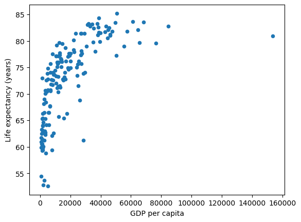
This data shows a couple of interesting relationships.
there are a number of countries with similar GDP per capita levels but a wide range in Life Expectancy
there appears to be a positive relationship between GDP per capita and life expectancy. Countries with higher GDP per capita tend to have higher life expectancy outcomes
Even though OLS is solving linear equations – one option we have is to transform the variables, such as through a log transform, and then use OLS to estimate the transformed variables.
By specifying logx you can plot the GDP per Capita data on a log scale
df.plot(x='gdppc', y='life_expectancy', kind='scatter', xlabel="GDP per capita", ylabel="Life expectancy (years)", logx=True);
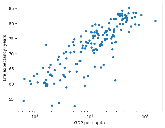
As you can see from this transformation – a linear model fits the shape of the data more closely.
df['log_gdppc'] = df['gdppc'].apply(np.log10)
df
| cntry | year | life_expectancy | gdppc | log_gdppc | |
|---|---|---|---|---|---|
| 0 | AFG | 2018 | 63.1 | 1934.5550 | 3.286581 |
| 1 | ALB | 2018 | 79.2 | 11104.1660 | 4.045486 |
| 2 | DZA | 2018 | 76.1 | 14228.0250 | 4.153145 |
| 3 | AGO | 2018 | 62.1 | 7771.4420 | 3.890502 |
| 4 | ARG | 2018 | 77.0 | 18556.3830 | 4.268493 |
| ... | ... | ... | ... | ... | ... |
| 161 | VNM | 2018 | 74.0 | 6814.1420 | 3.833411 |
| 162 | OWID_WRL | 2018 | 72.6 | 15212.4150 | 4.182198 |
| 163 | YEM | 2018 | 64.6 | 2284.8900 | 3.358865 |
| 164 | ZMB | 2018 | 62.3 | 3534.0337 | 3.548271 |
| 165 | ZWE | 2018 | 61.4 | 1611.4052 | 3.207205 |
166 rows × 5 columns
Q4: Use (46.1) and (46.2) to compute optimal values for \(\alpha\) and \(\beta\)
data = df[['log_gdppc', 'life_expectancy']].copy()  # Get Data from DataFrame

# Calculate the sample means
x_bar = data['log_gdppc'].mean()
y_bar = data['life_expectancy'].mean()
data
| log_gdppc | life_expectancy | |
|---|---|---|
| 0 | 3.286581 | 63.1 |
| 1 | 4.045486 | 79.2 |
| 2 | 4.153145 | 76.1 |
| 3 | 3.890502 | 62.1 |
| 4 | 4.268493 | 77.0 |
| ... | ... | ... |
| 161 | 3.833411 | 74.0 |
| 162 | 4.182198 | 72.6 |
| 163 | 3.358865 | 64.6 |
| 164 | 3.548271 | 62.3 |
| 165 | 3.207205 | 61.4 |
166 rows × 2 columns
# Compute the Sums
data['num'] = data['log_gdppc'] * data['life_expectancy'] - y_bar * data['log_gdppc']
data['den'] = pow(data['log_gdppc'],2) - x_bar * data['log_gdppc']
β = data['num'].sum() / data['den'].sum()
print(β)
12.643730292819708
α = y_bar - β * x_bar
print(α)
21.70209670138904
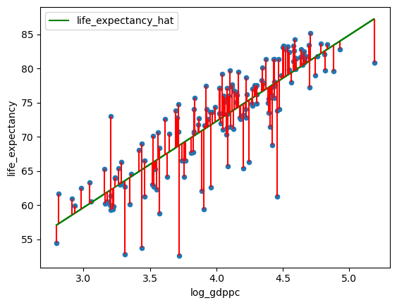
Q5: Plot the line of best fit found using OLS
data['life_expectancy_hat'] = α + β * df['log_gdppc']
data['error'] = data['life_expectancy_hat'] - data['life_expectancy']

fig, ax = plt.subplots()
data.plot(x='log_gdppc',y='life_expectancy', kind='scatter', ax=ax)
data.plot(x='log_gdppc',y='life_expectancy_hat', kind='line', ax=ax, color='g')
plt.vlines(data['log_gdppc'], data['life_expectancy_hat'], data['life_expectancy'], color='r')
<matplotlib.collections.LineCollection at 0x7fb0c1b66c10>
Exercise 46.2
Minimizing the sum of squares is not the only way to generate the line of best fit.
For example, we could also consider minimizing the sum of the absolute values, that would give less weight to outliers.
Solve for \(\alpha\) and \(\beta\) using the least absolute values