22. Bivariate Distributions#
22.1. Outline#
The lectures Probability Distributions, Observed Distributions and Fitting Distributions to Data all study a single variable at a time (e.g., a distribution of house prices).
Often we are interested in more than one variable.
In this situation, we typically wish to know how these variables relate to each other.
For example, do larger houses tend to sell for more?
In this lecture we give a quick introduction to bivariate distributions: probability distributions over pairs of random variables.
We cover joint distributions and marginals, independence, covariance and correlation, some of the ways that joint distributions arise, and the bivariate normal distribution.
We end with a preview of Simple Linear Regression Model.
We use the following imports:
import matplotlib.pyplot as plt
import pandas as pd
import numpy as np
import scipy.stats
import seaborn as sns

np.set_printoptions(legacy='1.25')   # print scalars as plain numbers
To motivate what follows, let’s look at the sale prices and floor areas of the Ames houses that we studied in Observed Distributions and Fitting Distributions to Data [De Cock, 2011].
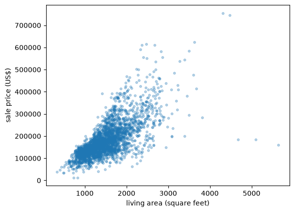
Fig. 22.1 House price against floor area#
Each point is one house.
In Observed Distributions we compared prices across four floor-area groups using box plots, and found that floor area is a good predictor of price.
The scatter plot above shows the same fact more directly (without first dividing the data into groups).
This is the kind of pattern that a bivariate distribution can describe.
22.2. Joint distributions#
Let’s begin with some theory and definitions.
We start with the discrete case (sums) and then cover the density case (integrals).
22.2.1. Discrete case#
Let’s start with two discrete random variables \(X\) and \(Y\), taking values in finite sets \(S_X\) and \(S_Y\).
The joint probability mass function of \(X\) and \(Y\) is the function \(p\) on \(S_X \times S_Y\) with
As with a single variable, the values of \(p\) are nonnegative and sum to one, now over both variables:
Let’s build an example from the house price data.
Let \(X = 1\) if a house’s floor area is above the sample mean and \(X=0\) otherwise, and define \(Y\) the same way for price.
X = (area > area.mean()).astype(int)
Y = (price > price.mean()).astype(int)
joint = pd.crosstab(X, Y, normalize=True)
joint.index.name = 'x (area above mean)'
joint.columns.name = 'y (price above mean)'
joint
| y (price above mean) | 0 | 1 |
|---|---|---|
| x (area above mean) | ||
| 0 | 0.479522 | 0.073038 |
| 1 | 0.137201 | 0.310239 |
Here each cell is the fraction of houses with that particular combination of \(X\) and \(Y\).
The four numbers in this table can be viewed as a joint PMF for \(X\) and \(Y\): they are nonnegative and sum to one.
Let’s visualize it as a heatmap, which makes the relative sizes of the four cells easier to compare than the raw numbers.
fig, ax = plt.subplots()
sns.heatmap(joint, annot=True, fmt='.2f', cmap='viridis', cbar=False, vmin=0, vmax=0.5, ax=ax)
ax.invert_yaxis()  # so x increases upward, matching a standard scatter plot
plt.show()
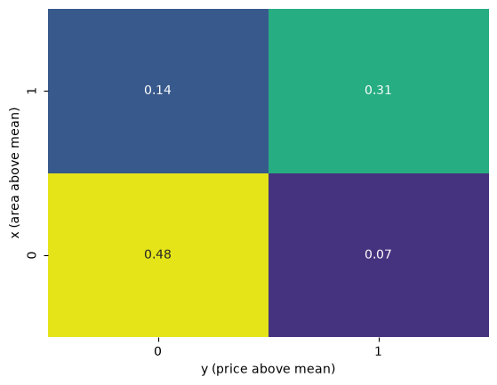
Fig. 22.2 Heatmap of the joint distribution#
The (below, below) cell is clearly the largest: around 48% of houses have both below-mean floor area and below-mean price.
Given a joint distribution, we can always recover the distribution of \(X\) on its own, by summing (or integrating) out \(Y\).
In the discrete case,
and symmetrically for \(p_Y\).
We call \(p_X\) and \(p_Y\) the marginal distributions of \(X\) and \(Y\).
In our table above, the marginals are the row and column sums:
p_X, p_Y = joint.sum(axis=1), joint.sum(axis=0)
p_X, p_Y
(x (area above mean)
 0    0.55256
 1    0.44744
 dtype: float64,
 y (price above mean)
 0    0.616724
 1    0.383276
 dtype: float64)
Neither marginal is close to 0.5: only around 45% of houses have above-mean floor area, and only around 38% sell for above-mean prices.
This is the right skew we met in Observed Distributions showing up again: a long right tail of large, expensive houses pulls the mean above the middle of the distribution, so below the mean covers more than half the sample.
Notice, though, that the marginals alone do not tell us the whole story.
Knowing the fraction of houses with above-mean area and the fraction with above-mean price, separately, says nothing about whether the same houses tend to have both — for that we need the joint distribution, not just the two marginals.
Let’s plot the two marginals side by side.
fig, axes = plt.subplots(1, 2, figsize=(9, 4))
axes[0].bar(['below mean', 'above mean'], p_X)
axes[0].set_title('marginal of x (area)')
axes[0].set_ylabel('probability')
axes[1].bar(['below mean', 'above mean'], p_Y)
axes[1].set_title('marginal of y (price)')
axes[1].set_ylabel('probability')
plt.show()
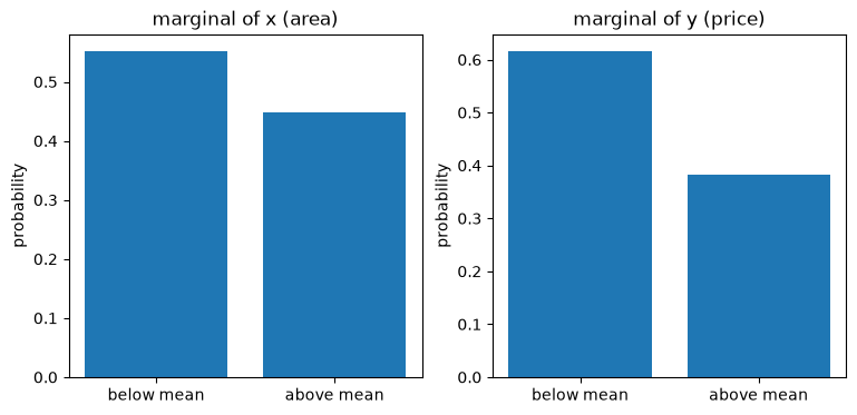
Fig. 22.3 The two marginal distributions#
22.2.2. Continuous case#
Some variables are continuous rather than discrete (e.g., area, price).
The continuous analog of the joint PMF is the joint probability density function \(p(x,y)\), a nonnegative function on \(\mathbb R^2\) with
We say that \((X,Y)\) has joint density \(p\) if, for every region \(A \subset \mathbb R^2\),
This means that \(\mathbb P\{(X,Y) \in A\}\) is equal to the volume of the three-dimensional space between \(p(x,y)\) and \(0\) over the two-dimensional region \(A\).
Let’s meet a specific and very useful example right away: the bivariate normal density.
Just as the normal distribution is the workhorse univariate distribution, the bivariate normal distribution is the workhorse joint distribution.
It has five parameters: the two means \(\mu_X, \mu_Y\), the two standard deviations \(\sigma_X, \sigma_Y\), and the correlation \(\rho \in (-1,1)\).
Its density is
It can be shown that, for this distribution, \(\rho\) is exactly the correlation between \(X\) and \(Y\).
SciPy provides this distribution as scipy.stats.multivariate_normal, which takes a mean and a covariance matrix (built here from \(\sigma_X, \sigma_Y, \rho\)).
def bivariate_normal(μ_x, μ_y, σ_x, σ_y, ρ):
    cov = [[σ_x**2, ρ * σ_x * σ_y],
           [ρ * σ_x * σ_y, σ_y**2]]
    return scipy.stats.multivariate_normal([μ_x, μ_y], cov)
Before looking at it from above, let’s see the density as it really is: a surface over the \((x,y)\) plane.
x_grid = np.linspace(-3, 3, 100)
y_grid = np.linspace(-3, 3, 100)
X_mesh, Y_mesh = np.meshgrid(x_grid, y_grid)
pos = np.dstack((X_mesh, Y_mesh))

u = bivariate_normal(0, 0, 1, 1, 0.6)

fig = plt.figure()
ax = fig.add_subplot(projection='3d')
ax.plot_surface(X_mesh, Y_mesh, u.pdf(pos), cmap='viridis', linewidth=0)
ax.set_xlabel('x')
ax.set_ylabel('y')
ax.set_zlabel('density')
plt.show()
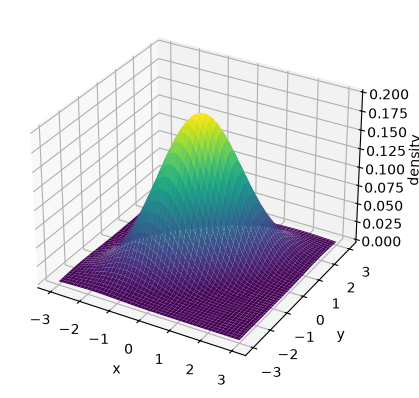
Fig. 22.4 The bivariate normal density surface#
This is the same kind of bell-shaped hill as the univariate normal density, just built over a plane instead of a line, and tilted by the correlation \(\rho\).
In practice it is much more convenient to look straight down at this hill and draw its contour lines, the way a topographic map shows the shape of a hill without drawing it in 3D.
Let’s do that for a few values of \(\rho\).
fig, axes = plt.subplots(1, 3, figsize=(12, 4), sharex=True, sharey=True)
for ax, ρ in zip(axes, (-0.8, 0.0, 0.8)):
    u = bivariate_normal(0, 0, 1, 1, ρ)
    ax.contour(X_mesh, Y_mesh, u.pdf(pos), levels=6, cmap='viridis')
    ax.set_title(rf'$\rho={ρ}$')
    ax.set_xlabel('x')
    ax.set_aspect('equal')
axes[0].set_ylabel('y')
plt.show()
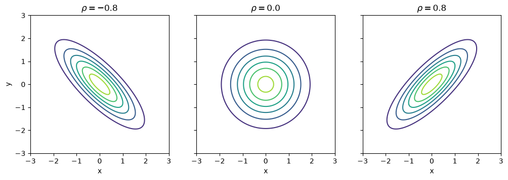
Fig. 22.5 Bivariate normal contours by correlation#
When \(\rho = 0\) the contours are circles.
When \(\rho \neq 0\) they become tilted ellipses, oriented along the line \(y=x\) when \(\rho > 0\) and \(y=-x\) when \(\rho < 0\).
Let’s now find the marginal distributions of \(X\) and \(Y\), the same way we did in the discrete case: by integrating the joint density over the other variable.
and symmetrically for \(p_Y\).
It can be shown that, for the bivariate normal, the marginal of \(X\) is \(N(\mu_X, \sigma_X^2)\) and the marginal of \(Y\) is \(N(\mu_Y, \sigma_Y^2)\) — in other words, each variable is, on its own, just an ordinary univariate normal.
Notice that neither marginal depends on \(\rho\) at all: the correlation describes how \(X\) and \(Y\) move together, and that information is exactly what is lost when we look at either variable in isolation — the same lesson the discrete example taught us above.
μ_x, σ_x = 0, 1
μ_y, σ_y = 2, 0.6

x_grid = np.linspace(μ_x - 4*σ_x, μ_x + 4*σ_x, 200)
y_grid = np.linspace(μ_y - 4*σ_y, μ_y + 4*σ_y, 200)

fig, axes = plt.subplots(1, 2, figsize=(9, 4))
axes[0].plot(x_grid, scipy.stats.norm(μ_x, σ_x).pdf(x_grid))
axes[0].set_title('marginal of x')
axes[0].set_xlabel('x')
axes[0].set_ylabel('density')
axes[1].plot(y_grid, scipy.stats.norm(μ_y, σ_y).pdf(y_grid))
axes[1].set_title('marginal of y')
axes[1].set_xlabel('y')
axes[1].set_ylabel('density')
plt.show()
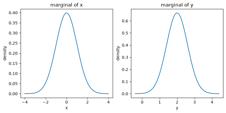
Fig. 22.6 Marginal densities of the bivariate normal#
22.3. Independence#
\(X\) and \(Y\) are called independent if the joint distribution factors into the product of the marginals:
Independence means that learning the value of \(X\) tells us nothing about \(Y\), and vice versa.
Let’s check whether our discrete example is close to independent, by comparing the joint table with the table we would get if \(X\) and \(Y\) were independent, i.e. the product of the marginals.
independent_table = pd.DataFrame(np.outer(p_X, p_Y),
                                  index=joint.index, columns=joint.columns)
independent_table
| y (price above mean) | 0 | 1 |
|---|---|---|
| x (area above mean) | ||
| 0 | 0.340777 | 0.211783 |
| 1 | 0.275947 | 0.171493 |
Under independence, every cell would just be the product of the corresponding marginals — for example, the (below, below) cell would be \(0.55 \times 0.62 \approx 0.34\).
Let’s put the two tables side by side as heatmaps, which makes the difference much easier to see than comparing raw numbers.
fig, axes = plt.subplots(1, 2, figsize=(9, 4))
sns.heatmap(joint, annot=True, fmt='.2f', cmap='viridis', cbar=False,
            vmin=0, vmax=0.45, ax=axes[0])
axes[0].set_title('actual joint')
axes[0].invert_yaxis()
sns.heatmap(independent_table, annot=True, fmt='.2f', cmap='viridis', cbar=False,
            vmin=0, vmax=0.45, ax=axes[1])
axes[1].set_title('if independent')
axes[1].invert_yaxis()
plt.show()
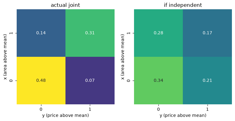
Fig. 22.7 Actual joint versus independent joint#
The independent heatmap is not flat, but it is smooth: it simply reflects the marginals, with the (below, below) cell largest because both marginals favor “below”.
The actual heatmap looks quite different: around 48% of houses land in the (below, below) cell alone — well above the 34% independence would predict — and the off-diagonal cells are correspondingly emptier than independence implies.
So \(X\) and \(Y\) are far from independent — exactly as we would expect, since larger houses tend to be more expensive.
22.4. Covariance and correlation#
Independence is an all-or-nothing property.
To measure the strength and direction of dependence, we use the covariance
where \(\mu_X = \mathbb E[X]\) and \(\mu_Y = \mathbb E[Y]\).
The covariance is positive when \(X\) and \(Y\) tend to be above their means together (and below their means together), and negative when one tends to be above its mean while the other is below.
If \(X\) and \(Y\) are independent, then \(\mathrm{Cov}(X,Y) = 0\).
Note
The converse is false: zero covariance does not imply independence.
It only rules out linear dependence.
We will see an example of this below, in the discussion of the bivariate normal distribution.
The covariance is measured in the units of \(X\) times the units of \(Y\), which makes it hard to interpret on its own.
We therefore usually standardize it into the correlation coefficient
where \(\sigma_X\) and \(\sigma_Y\) are the standard deviations of \(X\) and \(Y\).
Correlation is unit-free and always lies in \([-1, 1]\), with the extreme values attained only when \(Y\) is an exact linear function of \(X\).
Let’s compute it for our discrete house example, using np.corrcoef.
Given two arrays, np.corrcoef returns their full \(2 \times 2\) correlation matrix: ones down the diagonal (each variable is perfectly correlated with itself) and \(\mathrm{Corr}(X,Y)\) in both off-diagonal entries.
We only need that one number, so we index with [0, 1] to pull out the correlation between \(X\) and \(Y\).
np.corrcoef(X, Y)[0, 1]
0.5739323417660561
A correlation of around 0.57 between the above/below-mean indicators confirms what the table already showed us: floor area and price move together.
22.5. How joint distributions arise#
It is worth pausing to think about why two variables end up correlated.
Here are two simple and common mechanisms.
22.5.1. Independent components#
The simplest case is no relationship at all: draw \(X\) and \(Y\) independently.
rng = np.random.default_rng(1234)
N = 500
x_indep = rng.standard_normal(N)
y_indep = rng.standard_normal(N)

fig, ax = plt.subplots()
ax.scatter(x_indep, y_indep, alpha=0.5, s=10)
ax.set_xlabel('x')
ax.set_ylabel('y')
ax.set_aspect('equal')
plt.show()
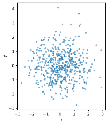
Fig. 22.8 Two independent normal variables#
There is no visible pattern: knowing \(x\) tells us nothing about where \(y\) will land.
22.5.2. A common building block#
A second and very common mechanism is that \(Y\) is built partly from \(X\).
For example, suppose
where \(U\) is noise, independent of \(X\), with mean zero and standard deviation \(\sigma_U\).
(Think of \(X\) as floor area and \(Y\) as price: bigger houses mechanically cost more to build, plus some noise from location, finish quality, and so on.)
Since \(U\) is independent of \(X\), \(\mathrm{Cov}(X, U) = 0\), and so
Similarly, \(\mathbb V[Y] = a^2 \sigma_X^2 + \sigma_U^2\), so that
The correlation is driven entirely by the relative size of the signal (\(a X\)) and the noise (\(U\)).
Let’s see this in a picture, fixing \(a=1\) and \(\sigma_X = 1\) and increasing \(\sigma_U\).
a = 1.0
sigma_U_vals = [0.2, 1.0, 3.0]

fig, axes = plt.subplots(1, 3, figsize=(12, 4), sharex=True, sharey=True)
for ax, sigma_U in zip(axes, sigma_U_vals):
    x = rng.standard_normal(N)
    u = rng.normal(scale=sigma_U, size=N)
    y = a * x + u
    rho = a / np.sqrt(a**2 + sigma_U**2)
    ax.scatter(x, y, alpha=0.5, s=10)
    ax.set_title(rf'$\sigma_U={sigma_U}$, $\rho={rho:.2f}$')
    ax.set_xlabel('x')
axes[0].set_ylabel('y')
plt.show()
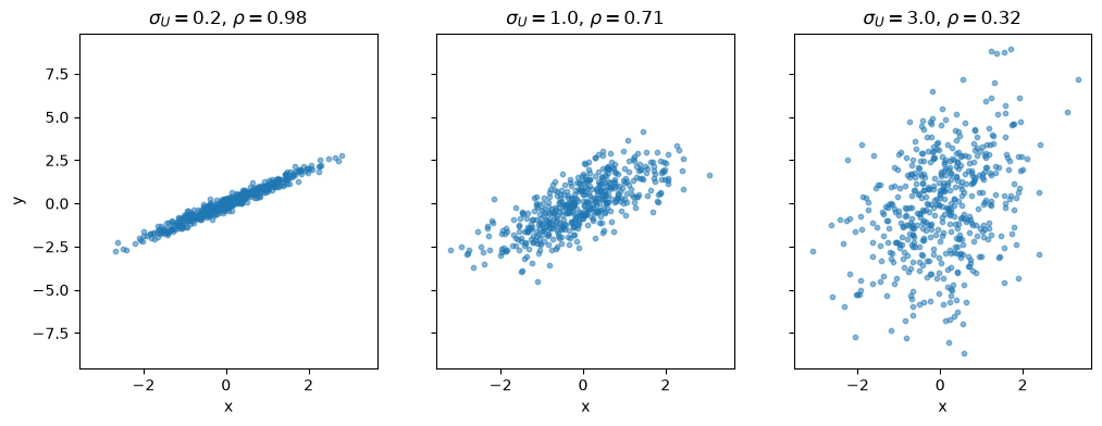
Fig. 22.9 Correlation strength as noise grows#
As the noise grows, the cloud of points fattens and the correlation falls, even though the underlying mechanism — \(Y\) built from \(X\) plus independent noise — never changes.
This is a useful mental model to have in mind whenever you see two correlated variables: often there is some shared component driving both, plus independent noise on top.
22.6. Back to the normal distribution#
We have now covered independence, covariance and correlation in general.
Let’s return to the bivariate normal density and connect it to what we have just learned.
Recall the contour plots above: when \(\rho = 0\) the contours were circles, and when \(\rho \neq 0\) they were tilted ellipses.
A circular contour is exactly what independence looks like here: the density factors into the product of the two marginal densities we found above, \(p(x,y) = p_X(x) \, p_Y(y)\).
So for the bivariate normal — and only for the bivariate normal — zero correlation is equivalent to independence.
Note
Two further properties that are special to the bivariate normal, and useful to know:
any linear combination \(a X + b Y\) is normally distributed, and
the conditional distribution of \(Y\) given \(X=x\) is itself normal, with a mean that is linear in \(x\).
We use the first property in the next subsection, and the second property later, when we preview linear regression.
It is worth seeing what a sample from this distribution looks like, since real data will never arrive as a clean density — only as points.
u = bivariate_normal(0, 0, 1, 1, 0.7)
sample = u.rvs(500, random_state=1234)

fig, ax = plt.subplots()
ax.scatter(sample[:, 0], sample[:, 1], alpha=0.4, s=10)
ax.contour(X_mesh, Y_mesh, u.pdf(pos), levels=6, cmap='viridis')
ax.set_xlabel('x')
ax.set_ylabel('y')
plt.show()
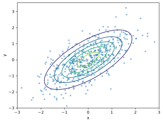
Fig. 22.10 Simulated draws from a bivariate normal#
The points scatter around the contours in exactly the elliptical cloud shape we should now expect, denser near the center and thinner in the tails.
Keep this picture in mind: it is the shape we will be looking for when we turn to real data below.
22.6.1. A word of caution#
It is tempting to think that, if \(X\) and \(Y\) are each individually normal, then the pair \((X,Y)\) must be bivariate normal.
This is false.
Here is a simple counterexample.
Let \(X\) be standard normal, and construct \(Y\) by
N = 2000
x = rng.standard_normal(N)
y = np.where(np.abs(x) < 1, x, -x)

g = sns.jointplot(x=x, y=y, height=5, alpha=0.4, s=8)
g.set_axis_labels('x', 'y')
plt.show()
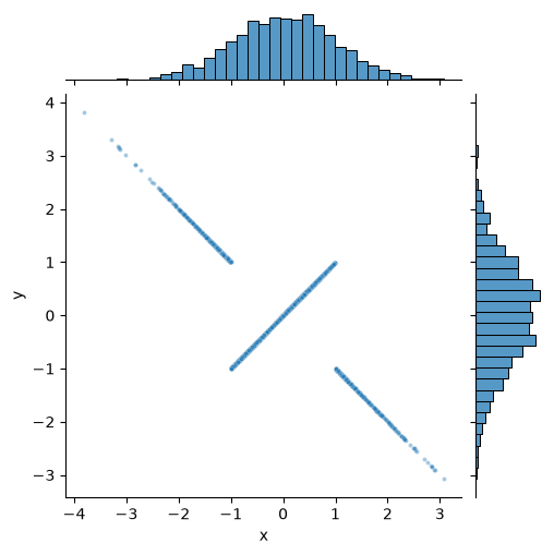
Fig. 22.11 Normal marginals, but not jointly normal#
The two histograms on the margins already look like the familiar bell shape of a normal density.
Since the standard normal density is symmetric about zero, flipping the sign of \(X\) whenever \(|X| \geq 1\) does not change its distribution, so \(Y\) is also standard normal.
scipy.stats.skew(y), scipy.stats.kurtosis(y)
(0.006167865844860767, 0.041921047786229515)
Both are close to zero, as they should be for a normal marginal.
Yet the joint distribution of \((X,Y)\) looks nothing like the elliptical clouds we saw above — it is concentrated on two crossing lines, plainly visible in the center panel above.
We noted above that, for a genuinely bivariate normal pair, every linear combination \(aX+bY\) is normal.
That gives us a sharper test than checking the marginals one at a time: let’s look at \(X+Y\).
s = x + y

fig, ax = plt.subplots()
ax.hist(s, bins=60, density=True)
ax.set_xlabel('x + y')
ax.set_ylabel('density')
plt.show()
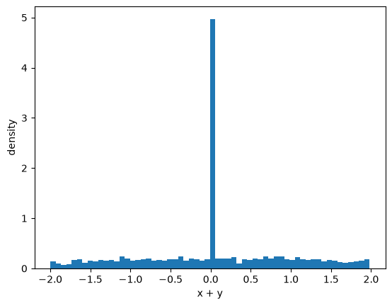
Fig. 22.12 Sum of the two variables#
Roughly a third of the mass sits in a single spike at zero — exactly the draws with \(|X| \geq 1\), for which \(Y=-X\) and so \(X+Y=0\) — with the rest spread out on either side.
This is about as far from a normal density as a distribution can look, even though the skewness and kurtosis of \(X+Y\) are both close to zero and would tell a much less dramatic story.
The lesson: checking that each variable individually looks normal is not enough to justify a bivariate normal model, and even standard numerical diagnostics can miss a failure that a picture catches instantly.
We should check the joint distribution directly, using the tools below.
22.7. Back to the data#
Let’s return to the house price and floor area data, and look at their joint distribution more closely.
We already saw the raw scatter plot at the start of the lecture.
A histogram-style alternative is the two-dimensional analog of the histograms we used in Observed Distributions: a hexbin plot, which counts the number of points falling into each small hexagonal bin and colors the bin accordingly.
Let’s draw one using seaborn, together with the marginal histogram of each variable along the edges — a direct picture of the joint distribution and the two marginal distributions we defined above, all in one figure.
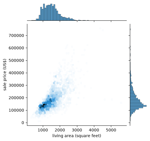
Fig. 22.13 Joint and marginal distributions#
The center panel is the joint distribution, in hexbin form, and matches the shape we already saw in the scatter plot.
The panels on the top and right are the two marginal distributions, exactly the row and column sums we used to build marginals in the discrete example above, now applied to the raw continuous data.
The sample correlation confirms the positive relationship numerically.
np.corrcoef(area, price)[0, 1]
0.7067799209766282
Recall from Fitting Distributions to Data that taking logarithms made the price data look much closer to normal.
The same is true of floor area, and the correlation between the two logged variables is almost the same as before.
log_price = np.log(price)
log_area = np.log(area)
np.corrcoef(log_area, log_price)[0, 1]
0.7231661556779683
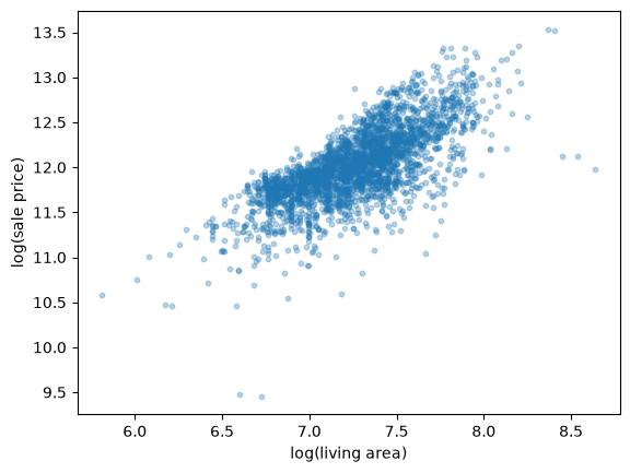
Fig. 22.14 Log price against log area#
This log-log scatter plot looks like a good candidate for a bivariate normal fit: an elliptical cloud, roughly symmetric along its main axis.
22.8. Fitting a bivariate normal by the method of moments#
Recall from Fitting Distributions to Data that the method of moments chooses parameters by matching sample moments to population moments.
The bivariate normal has five parameters, so we match five sample moments: the two means, the two standard deviations, and the correlation.
def fit_bivariate_normal(x, y):
    μ_x, μ_y = x.mean(), y.mean()
    σ_x, σ_y = x.std(), y.std()
    ρ = np.corrcoef(x, y)[0, 1]
    return bivariate_normal(μ_x, μ_y, σ_x, σ_y, ρ), (μ_x, μ_y, σ_x, σ_y, ρ)
fitted, (μ_x, μ_y, σ_x, σ_y, ρ) = fit_bivariate_normal(log_area, log_price)
μ_x, μ_y, σ_x, σ_y, ρ
(7.260127644825557,
 12.02096869011177,
 0.32468751544955865,
 0.40758691493422217,
 0.7231661556779683)
Let’s overlay the contours of the fitted density on the scatter plot of the data.
x_grid = np.linspace(log_area.min(), log_area.max(), 100)
y_grid = np.linspace(log_price.min(), log_price.max(), 100)
X_mesh, Y_mesh = np.meshgrid(x_grid, y_grid)
pos = np.dstack((X_mesh, Y_mesh))

fig, ax = plt.subplots()
ax.scatter(log_area, log_price, alpha=0.2, s=8)
ax.contour(X_mesh, Y_mesh, fitted.pdf(pos), levels=6, cmap='viridis')
ax.set_xlabel('log(living area)')
ax.set_ylabel('log(sale price)')
plt.show()
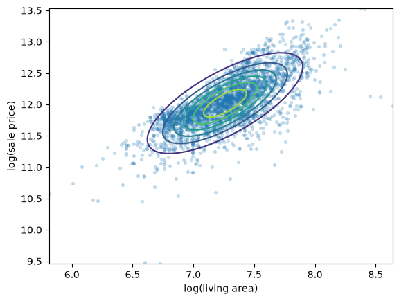
Fig. 22.15 Fitted bivariate normal density#
The elliptical contours line up well with the shape of the cloud of points.
The fit is not perfect — real data rarely is — but it captures the center, spread, and tilt of the data reasonably well.
22.9. Preview: regression as a conditional mean#
We noted above that, for the bivariate normal, the conditional distribution of \(Y\) given \(X=x\) is normal with a mean that is linear in \(x\).
The formula for that conditional mean is
This is a genuinely useful fact: it tells us the best guess of \(Y\) (in a mean-squared-error sense) given that we observe \(X=x\), and it is a straight line in \(x\).
Let’s plot it on top of our fitted contours.
slope = ρ * σ_y / σ_x
intercept = μ_y - slope * μ_x

fig, ax = plt.subplots()
ax.scatter(log_area, log_price, alpha=0.2, s=8)
ax.plot(x_grid, intercept + slope * x_grid, 'k--', lw=2,
        label=r'$\mathbb{E}[Y \mid X=x]$')
ax.set_xlabel('log(living area)')
ax.set_ylabel('log(sale price)')
ax.legend()
plt.show()
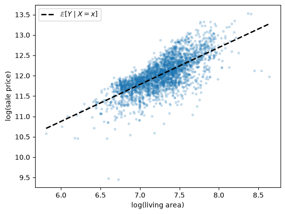
Fig. 22.16 The conditional mean line#
This line runs straight through the middle of the cloud of points, in the direction that best summarizes how \(y\) moves with \(x\).
In fact, if we compute the ordinary least squares line for this data — the method used in Simple Linear Regression Model — we get exactly the same slope and intercept.
β, α = np.polyfit(log_area, log_price, 1)
(α, β), (intercept, slope)
((5.430185999863143, 0.90780534622501),
 (5.430185999863148, 0.9078053462250089))
This is not a coincidence.
Fitting a line by OLS and computing the conditional mean of a fitted bivariate normal are, for this kind of data, the same calculation viewed two different ways.
Simple Linear Regression Model develops the OLS approach in full, without relying on an assumption of joint normality.
22.10. Exercises#
Exercise 22.1
In Observed Distributions we compared the monthly returns on Amazon and Costco shares using violin plots, treating each series separately.
Using yfinance, download monthly closing prices for 'AMZN' and 'COST' between 2000-1-1 and 2024-1-1, and compute monthly returns (percent change) for each, as in Observed Distributions.
Produce a scatter plot of the two return series and compute their sample correlation.
Fit a bivariate normal by the method of moments and overlay its contours on the scatter plot.
Recall from Fitting Distributions to Data that monthly stock returns have heavier tails than the normal distribution.
Given this, would you expect the bivariate normal fit here to be better or worse than the fit we found for house prices?
Check your answer against the figure.
Solution
!pip install --upgrade yfinance
import yfinance as yf

df_amzn = yf.download('AMZN', '2000-1-1', '2024-1-1', interval='1mo')
x_amazon = df_amzn['Close'].pct_change()[1:]['AMZN'] * 100

df_cost = yf.download('COST', '2000-1-1', '2024-1-1', interval='1mo')
x_costco = df_cost['Close'].pct_change()[1:]['COST'] * 100

np.corrcoef(x_amazon, x_costco)[0, 1]
[*********************100%***********************]  1 of 1 completed
[*********************100%***********************]  1 of 1 completed
0.28742448306023455
The correlation is modest and positive: the two stocks tend to move together, but far from perfectly.
fitted, (μ_x, μ_y, σ_x, σ_y, ρ) = fit_bivariate_normal(x_amazon.values, x_costco.values)

x_grid = np.linspace(x_amazon.min(), x_amazon.max(), 100)
y_grid = np.linspace(x_costco.min(), x_costco.max(), 100)
X_mesh, Y_mesh = np.meshgrid(x_grid, y_grid)
pos = np.dstack((X_mesh, Y_mesh))

fig, ax = plt.subplots()
ax.scatter(x_amazon, x_costco, alpha=0.4, s=10)
ax.contour(X_mesh, Y_mesh, fitted.pdf(pos), levels=6, cmap='viridis')
ax.set_xlabel('Amazon monthly return (%)')
ax.set_ylabel('Costco monthly return (%)')
plt.show()
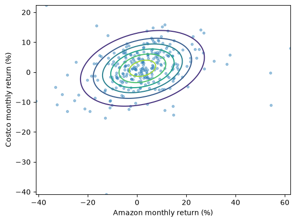
The fit here is visibly worse than it was for house prices.
The scatter has several points well outside the outermost contour, particularly the extreme returns during 2000–2001 and 2008–2009.
This matches what we already knew from Fitting Distributions to Data: monthly stock returns have heavier tails than the normal distribution allows for, and that failure carries over directly to the bivariate case.