20. Observed Distributions#
20.1. Outline#
In the lecture on probability distributions we studied probability distributions, which are mathematical objects.
In this lecture we turn to observed data — sets of numbers that we measure or collect.
We discuss how to summarize and visualize such data, and how observed data connects back to probability distributions.
A third lecture, Fitting Distributions to Data, then takes up the question of which probability distribution best describes a given data set.
!pip install --upgrade yfinance
import matplotlib.pyplot as plt
import pandas as pd
import numpy as np
import yfinance as yf
import scipy.stats
import seaborn as sns

np.set_printoptions(legacy='1.25')   # print scalars as plain numbers
Sometimes we refer to observed data or measurements as “distributions”.
For example, let’s say we observe the income of 10 people over a year:
data = [['Hiroshi', 1200],
        ['Ako', 1210],
        ['Emi', 1400],
        ['Daiki', 990],
        ['Chiyo', 1530],
        ['Taka', 1210],
        ['Katsuhiko', 1240],
        ['Daisuke', 1124],
        ['Yoshi', 1330],
        ['Rie', 1340]]

df = pd.DataFrame(data, columns=['name', 'income'])
df
| name | income | |
|---|---|---|
| 0 | Hiroshi | 1200 |
| 1 | Ako | 1210 |
| 2 | Emi | 1400 |
| 3 | Daiki | 990 |
| 4 | Chiyo | 1530 |
| 5 | Taka | 1210 |
| 6 | Katsuhiko | 1240 |
| 7 | Daisuke | 1124 |
| 8 | Yoshi | 1330 |
| 9 | Rie | 1340 |
In this situation, we might refer to the set of their incomes as the “income distribution.”
The terminology is confusing because this set is not a probability distribution — it’s just a collection of numbers.
However, as we will see, there are connections between observed distributions (i.e., sets of numbers like the income distribution above) and probability distributions.
Below we explore some observed distributions.
20.2. Sample moments#
Suppose we have an observed distribution with values \(\{x_1, \ldots, x_n\}\)
The sample mean of this distribution is defined as
The sample variance is defined as
and the sample standard deviation \(s\) is its square root.
For the income distribution given above, we can calculate these numbers via
x = df['income']
x.mean(), x.var(), x.std()
(1257.4, 22680.93333333333, 150.6019034850932)
Each of these statistics is the sample counterpart of one of the population quantities defined in Probability Distributions: we replace the probability distribution by the observed data, weighting each observation equally.
The same idea extends to higher moments.
The sample skewness and sample kurtosis are
and the sample excess kurtosis is \(\hat K - 3\).
Recall from Probability Distributions that a normal distribution has skewness zero and excess kurtosis zero.
This gives us a first, purely numerical, way to ask whether a data set looks normal.
Let’s try it on the heights of US adult women, which we saw were well described by a normal distribution.
url = ('https://github.com/QuantEcon/data-lectures/raw/main/'
       'lectures/us_adult_heights.csv')
heights = pd.read_csv(url)
female = heights[heights['sex'] == 'female']['height_cm']

scipy.stats.skew(female), scipy.stats.kurtosis(female)
(0.06940271585060076, -0.009473050923347603)
Both numbers are close to zero, which is consistent with what we saw in the figures.
Now let’s look at a data set that is far from normal.
The next cell reads in the sale prices of 2,930 houses sold in Ames, Iowa between 2006 and 2010, along with a few characteristics of each house [De Cock, 2011].
url = ('https://github.com/QuantEcon/data-lectures/raw/main/'
       'lectures/ames_house_prices.csv')
houses = pd.read_csv(url)
houses.head()
| price | bedrooms | living_area_sqft | year_built | neighborhood | |
|---|---|---|---|---|---|
| 0 | 215000 | 3 | 1656 | 1960 | NAmes |
| 1 | 105000 | 2 | 896 | 1961 | NAmes |
| 2 | 172000 | 3 | 1329 | 1958 | NAmes |
| 3 | 244000 | 3 | 2110 | 1968 | NAmes |
| 4 | 189900 | 3 | 1629 | 1997 | Gilbert |
Let’s compute the same statistics for the sale prices.
price = houses['price']
scipy.stats.skew(price), scipy.stats.kurtosis(price)
(1.7426073719460107, 5.108121716933333)
The skewness is large and positive, telling us that the data has a long right tail — a small number of houses sell for far more than the typical price.
The excess kurtosis is also large, telling us that extreme values are much more common than they would be for a normal distribution.
We saw exactly this combination in Probability Distributions when we looked at the lognormal distribution.
That suggests taking logarithms.
log_price = np.log(price)
scipy.stats.skew(log_price), scipy.stats.kurtosis(log_price)
(-0.014785864999287298, 1.509277466509812)
The skewness is now almost exactly zero.
In other words, the logarithm of the sale price looks far more normal than the sale price itself, which is the defining property of the lognormal distribution.
Our last example runs in the opposite direction.
The next cell reads the number of deaths in Japan in 2023 at each single year of age, from the World Population Prospects of the United Nations.
url = ('https://github.com/QuantEcon/data-lectures/raw/main/'
       'lectures/japan_deaths_by_age.csv')
deaths = pd.read_csv(url)
deaths.tail()
| age | deaths_male | deaths_female | deaths_total | |
|---|---|---|---|---|
| 96 | 96 | 9818 | 25563 | 35381 |
| 97 | 97 | 7652 | 22605 | 30258 |
| 98 | 98 | 5757 | 19343 | 25100 |
| 99 | 99 | 4197 | 15801 | 19998 |
| 100 | 100 | 8006 | 42277 | 50284 |
The data arrive as counts, so we expand them into a data set with one observation per death.
age_at_death = np.repeat(deaths['age'], deaths['deaths_total'])
len(age_at_death)
1524431
scipy.stats.skew(age_at_death), scipy.stats.kurtosis(age_at_death)
(-1.5993074774223388, 4.579170087851459)
Now the skewness is large and negative.
Deaths cluster at high ages, with a long tail running down towards zero — the mirror image of the house price data.
Note
The last age is recorded as “100 and over”, so every death above age 100 is counted as 100.
This is not a negligible group in Japan: it accounts for 3.3% of all deaths and 5.7% of female deaths.
We will see it below as a spike at the right-hand end of the histograms, which is an artifact of how the data are recorded rather than a feature of the data.
Exercise 20.1
If you try to check that the formulas given above for the sample mean and sample variance produce the same numbers, you will see that the variance isn’t quite right. This is because Pandas uses \(1/(n-1)\) instead of \(1/n\) as the term at the front of the variance. (Some books define the sample variance this way.) Confirm.
Note
The same issue arises with skewness and kurtosis, where different conventions adjust the estimates in different ways.
The Pandas methods x.skew() and x.kurt() apply such adjustments, so they do
not agree exactly with the formulas above, while scipy.stats.skew and
scipy.stats.kurtosis use the plain \(1/n\) versions.
The differences are small when \(n\) is large.
Recall also that scipy.stats.kurtosis returns \(\hat K - 3\) rather than
\(\hat K\), which is why we read its output as the excess kurtosis.
20.3. Sample quantiles#
Not every useful summary statistic is a moment.
If we sort the observations from smallest to largest, then the sample \(\tau\)-quantile is the value below which a fraction \(\tau\) of the observations fall.
The 0.5 quantile is the sample median and the 0.25 and 0.75 quantiles are the first and third sample quartiles.
Here are these values for the income data:
x.median(), x.quantile(0.25), x.quantile(0.75)
(1225.0, 1202.5, 1337.5)
Sample quantiles are useful because they are barely affected by a small number of extreme observations.
To see this, let’s replace the largest income in our data set with a very large value and recompute the mean and the median.
x_outlier = x.copy()
x_outlier.iloc[x.argmax()] = 10_000_000

x.mean(), x_outlier.mean()
(1257.4, 1001104.4)
x.median(), x_outlier.median()
(1225.0, 1225.0)
The mean shifts enormously while the median does not move at all.
The same issue arises with real data whenever the distribution is skewed.
Here are the mean and the median sale price of houses in Ames:
price.mean(), price.median()
(180796.0600682594, 160000.0)
The mean exceeds the median by around 13%, pulled up by the expensive houses in the right tail.
This is why house prices are almost always reported as medians.
For the age at death data the inequality runs the other way.
age_at_death.mean(), age_at_death.median()
(82.49081591754563, 85.0)
Here the mean is pulled below the median, by deaths at young ages.
In general, the mean sits on the side of the median towards which the data are skewed.
We will return to this point in Heavy-Tailed Distributions.
20.4. Visualization#
Summary statistics compress a data set down to a few numbers.
Visualization goes the other way, showing us the whole shape of the data.
We will cover
histograms
empirical distribution functions
kernel density estimates
box-and-whisker plots and
violin plots
20.4.1. Histograms#
We can histogram the income distribution we just constructed as follows
fig, ax = plt.subplots()
ax.hist(x, bins=5, density=True, histtype='bar')
ax.set_xlabel('income')
ax.set_ylabel('density')
plt.show()
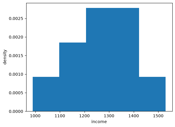
Fig. 20.1 Histogram of the income data#
Here is a histogram of the Ames house prices.
fig, ax = plt.subplots()
ax.hist(price, bins=50, density=True)
ax.set_xlabel('sale price (US$)')
ax.set_ylabel('density')
plt.show()
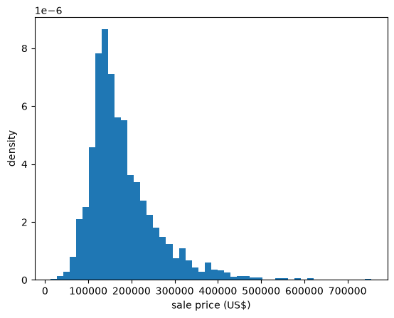
Fig. 20.2 Histogram of house prices#
The long right tail that the skewness told us about is clearly visible.
Let’s compare this with the histogram of the log prices.
fig, ax = plt.subplots()
ax.hist(log_price, bins=50, density=True)
ax.set_xlabel('log of sale price')
ax.set_ylabel('density')
plt.show()
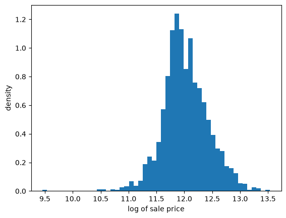
Fig. 20.3 Histogram of log house prices#
The second histogram is far more symmetric, as the sample skewness led us to expect.
Here is the age at death data, which we found to have negative skewness.
fig, ax = plt.subplots()
ax.hist(age_at_death, bins=101, density=True)
ax.set_xlabel('age at death')
ax.set_ylabel('density')
plt.show()
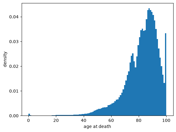
Fig. 20.4 Histogram of age at death#
The long tail now runs to the left, towards zero.
Let’s also compare men and women, using the sex-specific counts in the data set.
fig, ax = plt.subplots()
for sex in ('male', 'female'):
    ax.hist(deaths['age'], weights=deaths[f'deaths_{sex}'],
            bins=101, density=True, alpha=0.6, label=sex)
ax.set_xlabel('age at death')
ax.set_ylabel('density')
ax.legend()
plt.show()
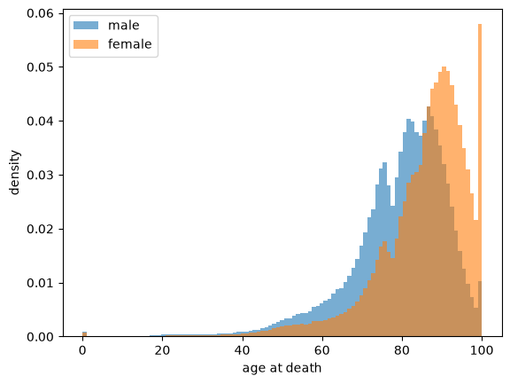
Fig. 20.5 Age at death by sex#
The two distributions have a similar shape but the female distribution sits to the right of the male distribution.
The median age at death is 82 for men and 88 for women.
The spike at the right-hand end is the “100 and over” category discussed above, which is far larger for women.
(Notice that we did not need to expand the counts here, since hist accepts
the counts directly as weights.)
Let’s look at another distribution from real data.
In particular, we will look at the monthly return on Amazon shares between 2000/1/1 and 2024/1/1.
The monthly return is calculated as the percent change in the share price over each month.
So we will have one observation for each month.
df = yf.download('AMZN', '2000-1-1', '2024-1-1', interval='1mo')
prices = df['Close']
x_amazon = prices.pct_change()[1:] * 100
x_amazon.head()
The first observation is the monthly return (percent change) over January 2000, which was
x_amazon.iloc[0]
Ticker
AMZN    6.679568
Name: 2000-02-01 00:00:00, dtype: float64
Let’s turn the return observations into an array and histogram it.
fig, ax = plt.subplots()
ax.hist(x_amazon, bins=20)
ax.set_xlabel('monthly return (percent change)')
ax.set_ylabel('density')
plt.show()
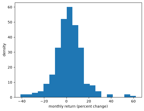
Fig. 20.6 Histogram of Amazon monthly returns#
20.4.2. Empirical cumulative distribution functions#
A histogram estimates the density of the data.
The empirical cumulative distribution function (ECDF) does the same job for the CDF.
For a sample \(\{x_1, \ldots, x_n\}\) it is defined as
In words, \(F_n(x)\) is just the fraction of observations that are less than or equal to \(x\).
The ECDF is a step function that jumps up by \(1/n\) at each observation.
Here is a function that plots it, obtained by sorting the data and stepping up as we move from left to right.
def plot_ecdf(sample, ax, **kwargs):
    x_sorted = np.sort(sample)
    n = len(x_sorted)
    ax.step(x_sorted, np.arange(1, n+1) / n, where='post', **kwargs)
Let’s apply it to the house price data.
fig, ax = plt.subplots()
plot_ecdf(price, ax)
ax.set_xlabel('sale price (US$)')
ax.set_ylabel('ECDF')
plt.show()
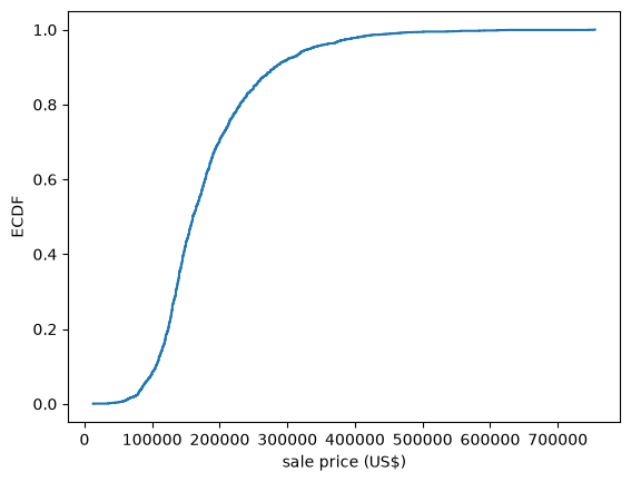
Fig. 20.7 ECDF of house prices#
Unlike a histogram, the ECDF requires no choice of bin width — it uses the data exactly as they are.
This makes it a good tool for comparing a data set with a probability distribution, since we can simply plot the two curves on the same axes.
Let’s compare the log prices with the CDF of the normal distribution that has the same mean and standard deviation.
u = scipy.stats.norm(log_price.mean(), log_price.std())
x_grid = np.linspace(log_price.min(), log_price.max(), 200)

fig, ax = plt.subplots()
plot_ecdf(log_price, ax, label='ECDF of log prices')
ax.plot(x_grid, u.cdf(x_grid), 'k--', alpha=0.7, label='normal CDF')
ax.set_xlabel('log of sale price')
ax.set_ylabel('probability')
ax.legend()
plt.show()
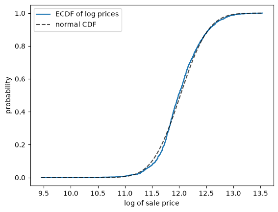
Fig. 20.8 Log prices against a normal CDF#
The two curves are close, although the fit is not perfect.
(Seaborn provides sns.ecdfplot, which produces the same figure with less code.)
20.4.3. Kernel density estimates#
Kernel density estimates (KDE) provide a simple way to estimate and visualize the density of a distribution.
If you are not familiar with KDEs, you can think of them as a smoothed histogram.
Let’s have a look at a KDE formed from the Amazon return data.
fig, ax = plt.subplots()
sns.kdeplot(x_amazon, ax=ax)
ax.set_xlabel('monthly return (percent change)')
ax.set_ylabel('KDE')
plt.show()
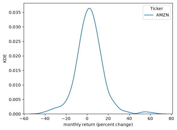
Fig. 20.9 KDE of Amazon monthly returns#
The smoothness of the KDE is dependent on how we choose the bandwidth.
fig, ax = plt.subplots()
sns.kdeplot(x_amazon, ax=ax, bw_adjust=0.1, alpha=0.5, label="bw=0.1")
sns.kdeplot(x_amazon, ax=ax, bw_adjust=0.5, alpha=0.5, label="bw=0.5")
sns.kdeplot(x_amazon, ax=ax, bw_adjust=1, alpha=0.5, label="bw=1")
ax.set_xlabel('monthly return (percent change)')
ax.set_ylabel('KDE')
plt.legend()
plt.show()
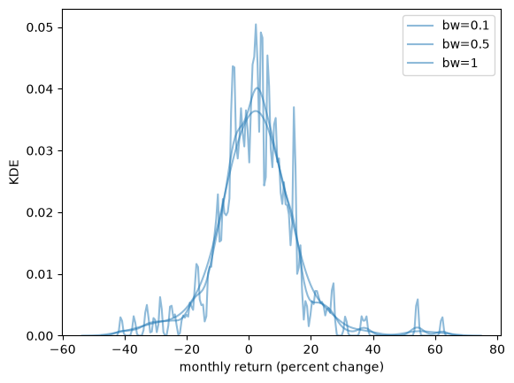
Fig. 20.10 KDE at three different bandwidths#
When we use a larger bandwidth, the KDE is smoother.
A suitable bandwidth is not too smooth (underfitting) or too wiggly (overfitting).
Since a KDE is a smoothed histogram, it is often helpful to show the two together.
Here is the log sale price data, with the histogram faded into the background.
fig, ax = plt.subplots()
ax.hist(log_price, bins=50, density=True, alpha=0.25, color='C0')
sns.kdeplot(log_price, ax=ax, color='C0', lw=2)
ax.set_xlabel('log of sale price')
ax.set_ylabel('density')
plt.show()
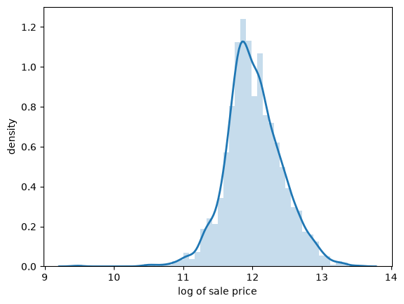
Fig. 20.11 KDE and histogram of log prices#
The KDE traces out the shape of the histogram while smoothing away the bin-to-bin variation.
20.4.4. Box-and-whisker plots#
A box-and-whisker plot (or box plot) summarizes a distribution using the sample quantiles discussed above.
The box spans the first and third quartiles, so its width is the interquartile range, and the line inside it is the median.
The whiskers extend to the most extreme observations lying within 1.5 interquartile ranges of the box, and observations beyond them are plotted individually.
Box plots discard a lot of information, which makes them well suited to comparing many groups at once.
For example, let’s compare house prices across houses with different numbers of bedrooms.
bedroom_counts = (1, 2, 3, 4, 5)
groups = [price[houses['bedrooms'] == b] for b in bedroom_counts]

fig, ax = plt.subplots()
ax.boxplot(groups, tick_labels=bedroom_counts)
ax.set_xlabel('bedrooms')
ax.set_ylabel('sale price (US$)')
plt.show()
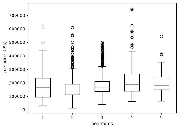
Fig. 20.12 House prices by number of bedrooms#
The figure carries a warning about reading too much into group averages.
Houses with four bedrooms do sell for more than houses with three, but one-bedroom houses have a higher median price than two-bedroom houses.
Moreover, the spread within every group is far larger than the differences across groups.
Evidently the number of bedrooms tells us relatively little about the price of a house.
Notice also that the individually plotted points sit almost entirely above the whiskers rather than below them.
This is the right skew again, now visible group by group.
Exercise 20.2
The data set also records the floor area of each house, in square feet, in the
column living_area_sqft.
Split the houses into four groups of equal size according to floor area (the
Pandas function qcut will do this for you) and produce a box plot of sale
price for each group.
Is floor area a better predictor of price than the number of bedrooms?
Solution
Here is one solution:
area_quartile = pd.qcut(houses['living_area_sqft'], 4,
                        labels=['Q1', 'Q2', 'Q3', 'Q4'])
groups = [price[area_quartile == q] for q in ('Q1', 'Q2', 'Q3', 'Q4')]

fig, ax = plt.subplots()
ax.boxplot(groups, tick_labels=['Q1', 'Q2', 'Q3', 'Q4'])
ax.set_xlabel('quartile of floor area')
ax.set_ylabel('sale price (US$)')
plt.show()
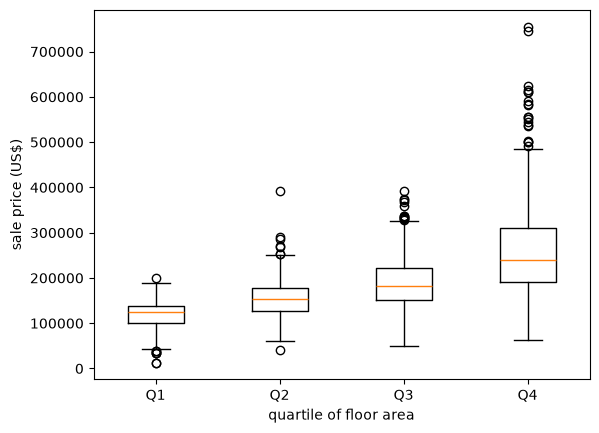
Now the medians increase steadily from one group to the next, and the gaps between the groups are large relative to the spread within them.
Floor area is clearly the better predictor.
20.4.5. Violin plots#
Another way to display an observed distribution is via a violin plot.
fig, ax = plt.subplots()
ax.violinplot(x_amazon)
ax.set_ylabel('monthly return (percent change)')
ax.set_xlabel('KDE')
plt.show()
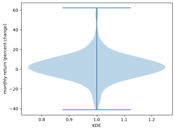
Fig. 20.13 Violin plot of Amazon returns#
Violin plots are particularly useful when we want to compare different distributions.
For example, let’s compare the monthly returns on Amazon shares with the monthly return on Costco shares.
df = yf.download('COST', '2000-1-1', '2024-1-1', interval='1mo')
prices = df['Close']
x_costco = prices.pct_change()[1:] * 100
fig, ax = plt.subplots()
ax.violinplot([x_amazon['AMZN'], x_costco['COST']])
ax.set_ylabel('monthly return (percent change)')
ax.set_xlabel('retailers')

ax.set_xticks([1, 2])
ax.set_xticklabels(['Amazon', 'Costco'])
plt.show()
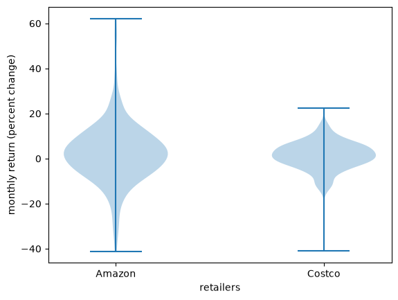
Fig. 20.14 Amazon and Costco monthly returns#
As a second comparison, let’s return to the age at death data and separate men from women.
male_deaths = np.repeat(deaths['age'], deaths['deaths_male'])
female_deaths = np.repeat(deaths['age'], deaths['deaths_female'])

fig, ax = plt.subplots()
ax.violinplot([male_deaths, female_deaths], showmedians=True)
ax.set_ylabel('age at death')
ax.set_xlabel('sex')

ax.set_xticks([1, 2])
ax.set_xticklabels(['male', 'female'])
plt.show()
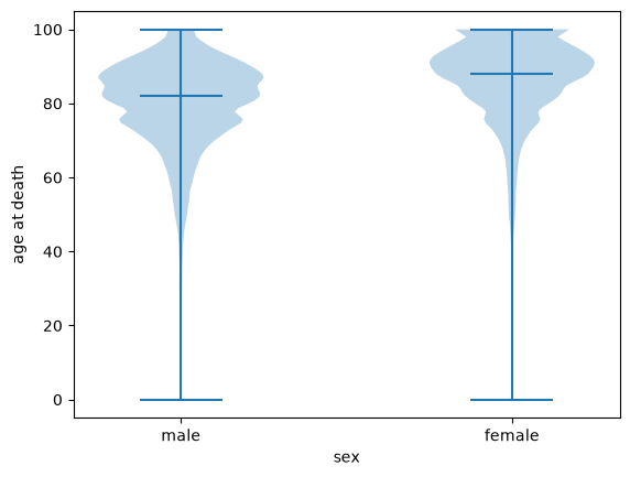
Fig. 20.15 Age at death, male and female#
The violin plot shows the whole shape of each distribution, rather than the five numbers that a box plot reduces it to.
Here that matters: both distributions are strongly left-skewed, with a thin tail of deaths at young ages, and the female distribution is both shifted upwards and more concentrated at the top.
20.5. Connection to probability distributions#
Let’s discuss the connection between observed distributions and probability distributions.
Sometimes it’s helpful to imagine that an observed distribution is generated by a particular probability distribution.
For example, we might look at the returns from Amazon above and imagine that they were generated by a normal distribution.
(Even though this is not true, it might be a helpful way to think about the data.)
Here we match a normal distribution to the Amazon monthly returns by setting the sample mean to the mean of the normal distribution and the sample variance equal to the variance.
(This recipe is called the method of moments, and Fitting Distributions to Data develops it in full.)
Then we plot the density and the histogram.
μ = x_amazon.mean()
σ_squared = x_amazon.var()
σ = np.sqrt(σ_squared)
u = scipy.stats.norm(μ, σ)
x_grid = np.linspace(-50, 65, 200)
fig, ax = plt.subplots()
ax.plot(x_grid, u.pdf(x_grid))
ax.hist(x_amazon, density=True, bins=40)
ax.set_xlabel('monthly return (percent change)')
ax.set_ylabel('density')
plt.show()
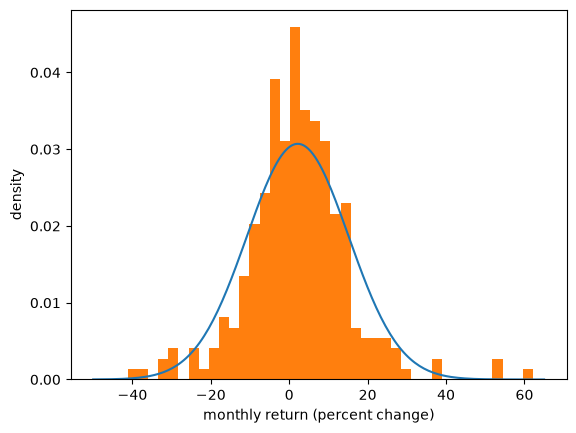
Fig. 20.16 Amazon returns and a fitted normal#
The match between the histogram and the density is not bad but also not very good.
One reason is that the normal distribution is not really a good fit for this observed data — we will discuss this point again when we talk about heavy tailed distributions.
Of course, if the data really is generated by the normal distribution, then the fit will be better.
Let’s see this in action
first we generate random draws from the normal distribution
then we histogram them and compare with the density.
μ, σ = 0, 1
u = scipy.stats.norm(μ, σ)
N = 2000  # Number of observations
x_draws = u.rvs(N)
x_grid = np.linspace(-4, 4, 200)
fig, ax = plt.subplots()
ax.plot(x_grid, u.pdf(x_grid))
ax.hist(x_draws, density=True, bins=40)
ax.set_xlabel('x')
ax.set_ylabel('density')
plt.show()
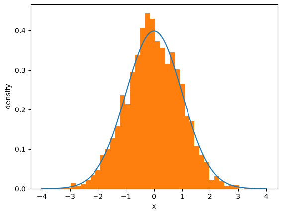
Fig. 20.17 Draws from the normal distribution#
Note that if you keep increasing \(N\), which is the number of observations, the fit will get better and better.
We investigate this convergence in the next section.
20.6. Larger samples#
Throughout this lecture we have used observed data to say something about an underlying distribution.
This only works if a larger sample tells us more.
Let’s check that it does, using the ECDF, since it estimates the CDF without requiring us to choose a bin width or a bandwidth.
We draw samples of increasing size from a fixed distribution and compare each ECDF with the CDF that generated it.
u = scipy.stats.lognorm(s=0.5)
x_grid = np.linspace(0, 5, 200)

fig, ax = plt.subplots()
for n in (10, 100, 1000):
    plot_ecdf(u.rvs(n, random_state=1234), ax, alpha=0.7, label=f'$n = {n}$')
ax.plot(x_grid, u.cdf(x_grid), 'k--', lw=2, label='true CDF')
ax.set_xlabel('x')
ax.set_ylabel('probability')
ax.legend()
plt.show()
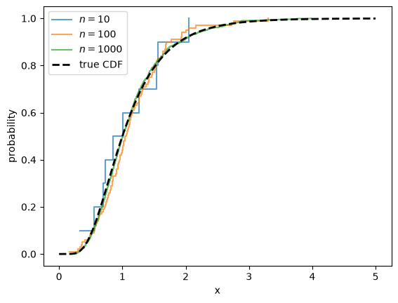
Fig. 20.18 ECDFs converge to the true CDF#
The ECDF is ragged when \(n = 10\) and almost indistinguishable from the true CDF by the time \(n = 1000\).
The sample moments behave the same way.
for n in (10, 100, 1000, 1_000_000):
    x_draws = u.rvs(n, random_state=1234)
    print(f'n = {n:>9,}:  sample mean = {x_draws.mean():.4f}')
print(f'{"":16}population mean = {u.mean():.4f}')
n =        10:  sample mean = 1.0573
n =       100:  sample mean = 1.1398
n =     1,000:  sample mean = 1.1340
n = 1,000,000:  sample mean = 1.1332
                population mean = 1.1331
This convergence is a version of the law of large numbers, which we discuss in LLN and CLT.
20.6.1. The role of independence#
The convergence above is not automatic.
It depends on a property of the sample that is easy to overlook, because
rvs supplies it silently: the draws it returns are independent.
To see why this matters, suppose we take a single draw \(X\) from our distribution and then set
Every \(X_i\) now has exactly the right distribution.
Judged one at a time, these are perfectly good observations.
But they are useless as a sample, as the next figure shows.
x = u.rvs(random_state=1234)         # a single draw

fig, ax = plt.subplots()
for n in (10, 100, 1000):
    x_draws = np.full(n, x)          # repeated n times
    plot_ecdf(x_draws, ax, alpha=0.7, label=f'$n = {n}$')
ax.plot(x_grid, u.cdf(x_grid), 'k--', lw=2, label='true CDF')
ax.set_xlabel('x')
ax.set_ylabel('probability')
ax.legend()
plt.show()
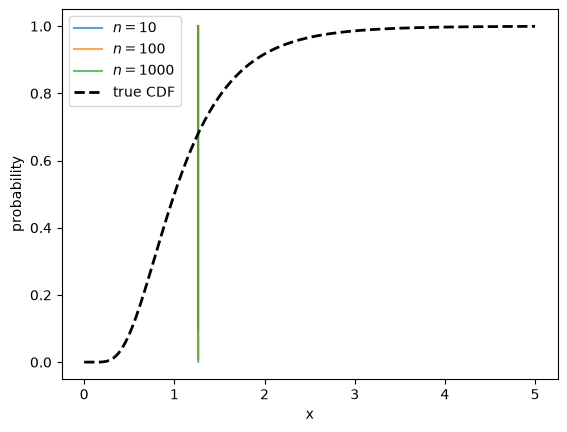
Fig. 20.19 Repeated draws of a single value#
The three ECDFs lie exactly on top of one another: each is a single step at \(X\), and increasing \(n\) changes nothing.
The sample never approaches the distribution it came from, no matter how large we make it.
The reason is that the observations after the first one carry no information we did not already have.
Note
Independence is a clean sufficient condition rather than a necessary one.
Many dependent samples work perfectly well — the monthly returns we histogrammed above are certainly not independent, since volatile months tend to follow volatile months.
What matters is that new observations keep bringing new information, which the example above destroys entirely.
The general question of what a sample can tell us about its distribution is taken up in LLN and CLT.