21. Fitting Distributions to Data#
21.1. Outline#
In Probability Distributions we studied a collection of common probability distributions.
In Observed Distributions we studied observed data.
In this lecture we connect the two, by asking a question that arises constantly in applied work:
given a data set, which probability distribution should we use to describe it?
The question has two parts.
First, we must choose a parametric class — a set of distributions indexed by a small number of parameters.
For example, the normal distributions form a parametric class, indexed by the mean \(\mu\) and the standard deviation \(\sigma\).
The Poisson distributions form another, indexed by the single parameter \(\lambda\).
Second, having chosen a class, we must choose the parameters within it that make the fit as close as possible.
This lecture is mainly about the first part.
For the second we use just one technique, called the method of moments, leaving a fuller treatment to Maximum Likelihood Estimation.
Even so, we start with the parameters, since we have to be able to fit a class before we can judge it.
!pip install --upgrade yfinance
import matplotlib.pyplot as plt
import pandas as pd
import numpy as np
import yfinance as yf
import scipy.stats

np.set_printoptions(legacy='1.25')   # print scalars as plain numbers
Let’s use the Ames house price data that we met in Observed Distributions.
url = ('https://github.com/QuantEcon/data-lectures/raw/main/'
       'lectures/ames_house_prices.csv')
houses = pd.read_csv(url)
price = houses['price']
21.2. The method of moments#
Suppose we have settled on a parametric class and now want to choose its parameters.
One simple and general strategy is the method of moments.
If the class has \(k\) parameters, we
compute the first \(k\) sample moments of the data,
write down the corresponding population moments as functions of the parameters, and
choose the parameters that make the two sets of numbers equal.
In effect we are asking the distribution to reproduce the features of the data that we consider most important.
We have already used this idea once, in Probability Distributions, when we fitted a normal distribution to the heights of US adults.
The normal distribution has two parameters, so we used two moments: we set \(\mu\) equal to the sample mean and \(\sigma\) equal to the sample standard deviation.
Let’s apply the same idea to the house price data, using two classes that live on \((0, \infty)\) and hence respect the fact that prices are positive.
The lognormal distribution has parameters \(\mu\) and \(\sigma\), with
Setting these equal to the sample mean \(\bar x\) and sample variance \(s^2\) and solving gives
The gamma distribution has parameters \(\alpha\) and \(\beta\), with mean \(\alpha / \beta\) and variance \(\alpha / \beta^2\).
Solving in the same way is easier here:
Let’s implement all three fits.
def fit_normal(sample):
    return scipy.stats.norm(sample.mean(), sample.std())

def fit_lognormal(sample):
    m, v = sample.mean(), sample.var()
    σ_squared = np.log(1 + v / m**2)
    μ = np.log(m) - σ_squared / 2
    return scipy.stats.lognorm(s=np.sqrt(σ_squared), scale=np.exp(μ))

def fit_gamma(sample):
    m, v = sample.mean(), sample.var()
    return scipy.stats.gamma(a=m**2 / v, scale=v / m)
Each function returns a distribution object of the kind we worked with in Probability Distributions.
Let’s check that the fitted lognormal reproduces the mean and variance of the data, as it was constructed to do.
u = fit_lognormal(price)
u.mean(), price.mean()
(180796.06006825934, 180796.0600682594)
u.var(), price.var()
(6381883615.688435, 6381883615.6884365)
Now let’s plot the three fitted densities against a histogram of the data.
fits = {'normal': fit_normal(price),
        'lognormal': fit_lognormal(price),
        'gamma': fit_gamma(price)}

x_grid = np.linspace(0, price.max(), 400)

fig, ax = plt.subplots()
ax.hist(price, bins=50, density=True, alpha=0.25, color='C0')
for label, u in fits.items():
    ax.plot(x_grid, u.pdf(x_grid), lw=2, alpha=0.8, label=label)
ax.set_xlabel('sale price (US$)')
ax.set_ylabel('density')
ax.legend()
plt.show()
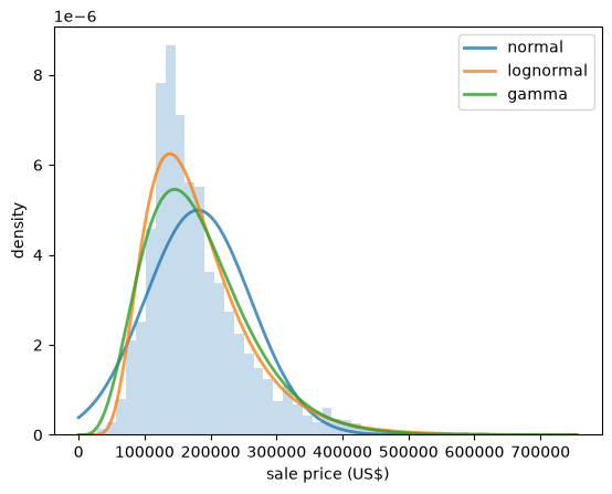
Fig. 21.1 Three fitted densities for house prices#
The normal density is visibly wrong: it is symmetric, while the data are not, and it puts weight on negative prices.
The other two look plausible.
To choose between them we need something sharper than a glance at a figure.
21.3. Q-Q plots#
A Q-Q plot (short for quantile-quantile plot) compares two distributions by plotting their quantiles against each other.
To compare a sample with a fitted distribution, we sort the data
Which quantile does \(x_{(i)}\) estimate?
Recall from Observed Distributions that the ECDF steps up by \(1/n\) at each observation.
At \(x_{(i)}\) it steps up from \((i-1)/n\) to \(i/n\).
In other words, a fraction \((i-1)/n\) of the observations lie strictly below \(x_{(i)}\), while a fraction \(i/n\) lie at or below it.
So the data do not single out one order for \(x_{(i)}\) to estimate — they supply a small interval of them.
The usual compromise is to split the difference and treat \(x_{(i)}\) as an estimate of the quantile of order \((i - 0.5)/n\).
This choice also avoids a problem at the top of the sample.
Had we used \(i/n\), the largest observation would be matched with the quantile of order \(n/n = 1\), which is \(+\infty\) for the normal, the lognormal and the other unbounded distributions we work with.
If the fitted distribution is a good description of the data, then \(x_{(i)}\) should be close to the corresponding quantile of that distribution, which is
Note
Other conventions are in use, such as \(i/(n+1)\) and \((i - 0.375)/(n + 0.25)\).
They are called plotting positions, and the choice between them affects only the two ends of the figure, by an amount that shrinks as \(n\) grows.
So we plot the fitted quantiles on the horizontal axis and the sample values on the vertical axis.
A good fit puts the points on the 45 degree line.
def qq_plot(sample, u, ax, **kwargs):
    "Plot sample quantiles against the quantiles of the distribution u."
    x_sorted = np.sort(sample)
    n = len(x_sorted)
    p = (np.arange(1, n+1) - 0.5) / n
    ax.plot(u.ppf(p), x_sorted, '.', ms=3, alpha=0.6, **kwargs)
    lo, hi = u.ppf(p[0]), u.ppf(p[-1])
    ax.plot([lo, hi], [lo, hi], 'k--', lw=2)
    ax.set_xlabel('fitted quantiles')
    ax.set_ylabel('sample quantiles')
Let’s start with a case where we expect a good fit.
In Observed Distributions we found that the heights of US adult women have sample skewness and excess kurtosis close to zero.
url = ('https://github.com/QuantEcon/data-lectures/raw/main/'
       'lectures/us_adult_heights.csv')
heights = pd.read_csv(url)
female = heights[heights['sex'] == 'female']['height_cm']

fig, ax = plt.subplots()
qq_plot(female, fit_normal(female), ax)
plt.show()
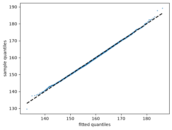
Fig. 21.2 Female heights against a fitted normal#
The points lie almost exactly on the line, apart from mild wandering at the two ends, where the sample contains few observations and the quantile estimates are noisy.
Now let’s try the house prices against a fitted normal.
fig, ax = plt.subplots()
qq_plot(price, fit_normal(price), ax)
plt.show()
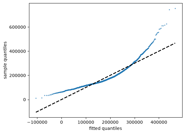
Fig. 21.3 House prices against a fitted normal#
This is a very different picture.
The points curve away from the line, and the departure has a clear meaning: towards the right, the sample quantiles are far larger than the fitted ones, so the data have a longer right tail than the normal distribution allows.
The shape of a departure tells us how the fit fails.
Points curving upwards, as here, indicate skewness to the right.
Points forming an S-shape — below the line on the left, above it on the right — indicate that both tails of the data are heavier than the fitted distribution.
Let’s check the second case by taking logs, which we know makes the house price data roughly symmetric.
log_price = np.log(price)

fig, ax = plt.subplots()
qq_plot(log_price, fit_normal(log_price), ax)
plt.show()
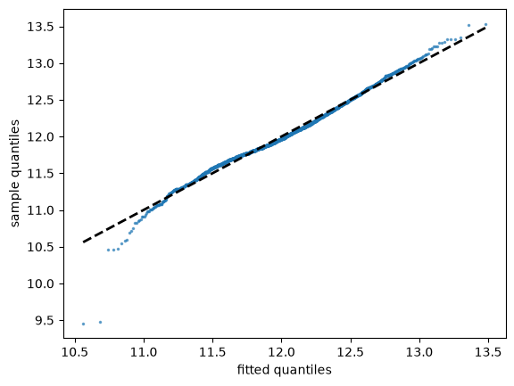
Fig. 21.4 Log house prices against a normal#
The curvature is gone, confirming what the sample skewness told us in Observed Distributions.
Note
The statsmodels package provides sm.qqplot, which produces such figures in
one line, comparing the data with a normal distribution by default.
We have built our own instead, partly because the construction is worth understanding and partly because our version compares the data with any distribution we choose, as we do below.
21.4. The Kolmogorov-Smirnov statistic#
Q-Q plots are informative but they require us to judge a picture.
Sometimes we want a single number that measures how far the data are from a fitted distribution.
One natural measure compares the ECDF of the data, which we met in Observed Distributions, with the CDF of the fitted distribution.
The Kolmogorov-Smirnov statistic is the largest vertical gap between them:
Since \(F_n\) only jumps at the observations, we can compute \(D\) by checking the gap immediately before and after each jump.
def ks_statistic(sample, u):
    "Largest vertical distance between the ECDF of the sample and the CDF of u."
    x_sorted = np.sort(sample)
    n = len(x_sorted)
    F = u.cdf(x_sorted)
    above = np.arange(1, n+1) / n - F     # gap just after each jump
    below = F - np.arange(0, n) / n       # gap just before each jump
    return max(above.max(), below.max())
Let’s see what it measures, by drawing the ECDF and the fitted CDF for the log prices together with the gap that attains the maximum.
u = fit_normal(log_price)
x_sorted = np.sort(log_price)
n = len(x_sorted)
F = u.cdf(x_sorted)

# locate the largest gap
gaps = np.maximum(np.arange(1, n+1) / n - F, F - np.arange(0, n) / n)
i = gaps.argmax()

fig, ax = plt.subplots()
ax.step(x_sorted, np.arange(1, n+1) / n, where='post', lw=2, label='ECDF')
x_grid = np.linspace(x_sorted[0], x_sorted[-1], 200)
ax.plot(x_grid, u.cdf(x_grid), 'k--', lw=2, alpha=0.7, label='fitted normal CDF')
ax.vlines(x_sorted[i], F[i], (i+1) / n, color='C3', lw=3, label='largest gap')
ax.set_xlabel('log of sale price')
ax.set_ylabel('probability')
ax.legend()
plt.show()
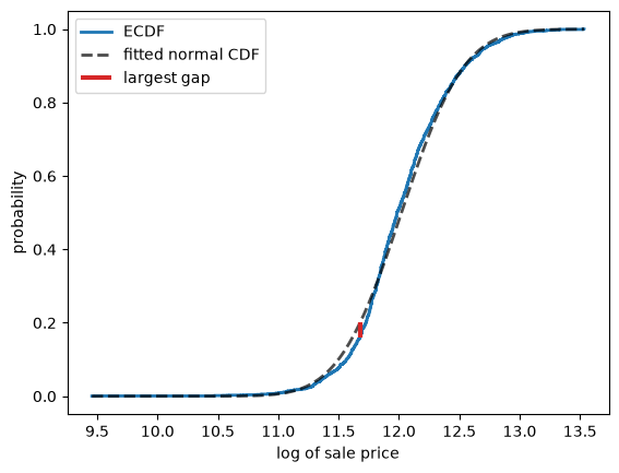
Fig. 21.5 Largest gap between ECDF and CDF#
ks_statistic(log_price, u)
0.041302695555679836
The statistic is small, which tells us that the ECDF never strays far from the fitted CDF.
Note
You might expect that we can now test whether the data came from the fitted distribution, by asking whether \(D\) is larger than chance alone would produce.
This is exactly what the Kolmogorov-Smirnov test does, and scipy implements
it as scipy.stats.kstest.
We do not pursue it here, because it requires knowing how \(D\) behaves when the distribution really is correct, which needs more theory than we have developed.
There is also a trap: the usual theory assumes that the distribution is specified in advance, whereas we chose its parameters using the same data.
21.5. Choosing a parametric class#
We now have a way to choose between candidate classes.
For each class, we fit the parameters by the method of moments and then compute \(D\).
The class with the smallest \(D\) is the one whose CDF stays closest to the data.
Let’s apply this to the house prices.
results = pd.Series({label: ks_statistic(price, u) for label, u in fits.items()})
results.sort_values()
lognormal    0.053044
gamma        0.070460
normal       0.123422
dtype: float64
The lognormal distribution wins, with the gamma second and the normal a distant third.
This agrees with what we found in Observed Distributions, where taking logs of the price data produced a sample skewness of almost exactly zero.
Here are the three fitted CDFs against the ECDF of the data, which shows the same ranking.
fig, ax = plt.subplots()
ax.step(np.sort(price), np.arange(1, len(price)+1) / len(price),
        where='post', color='k', lw=2, label='ECDF')
x_grid = np.linspace(price.min(), price.max(), 400)
for label, u in fits.items():
    ax.plot(x_grid, u.cdf(x_grid), lw=2, alpha=0.7, label=label)
ax.set_xlabel('sale price (US$)')
ax.set_ylabel('probability')
ax.legend()
plt.show()
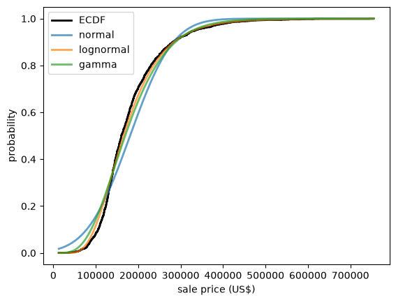
Fig. 21.6 Fitted CDFs against the ECDF#
Three warnings are in order.
First, the comparison is only fair when the classes have the same number of parameters, as they do here.
A class with more parameters can bend itself closer to any data set, and \(D\) does not charge it for the privilege.
In particular, if one class is a special case of another, the larger class can never do worse.
Second, \(D\) is most sensitive in the middle of the distribution, where the CDF is changing quickly, and least sensitive in the tails.
If we care mainly about extreme outcomes, as we often do in economics and finance, then a small \(D\) can be misleading.
Third, the winner is only the best of the candidates we happened to try.
Nothing here tells us that the winning class is a good description of the data — only that it is better than the alternatives.
We take up that point below.
21.6. Count data#
So far our data have been continuous.
The method of moments applies just as well to discrete data.
Consider the Poisson distribution, which we met in Probability Distributions as a model for the number of events in a fixed interval.
It has a single parameter \(\lambda\), and its mean is \(\lambda\), so the method of moments gives
Let’s try it on the number of goals scored in football matches.
The data set contains the full-time score of every match in ten seasons of the English Premier League.
url = ('https://github.com/QuantEcon/data-lectures/raw/main/'
       'lectures/epl_match_goals.csv')
matches = pd.read_csv(url)
matches.head()
| season | date | home_team | away_team | home_goals | away_goals | |
|---|---|---|---|---|---|---|
| 0 | 2015-16 | 2015-08-08 | Manchester United | Tottenham Hotspur | 1 | 0 |
| 1 | 2015-16 | 2015-08-08 | AFC Bournemouth | Aston Villa | 0 | 1 |
| 2 | 2015-16 | 2015-08-08 | Everton FC | Watford FC | 2 | 2 |
| 3 | 2015-16 | 2015-08-08 | Leicester City | Sunderland AFC | 4 | 2 |
| 4 | 2015-16 | 2015-08-08 | Norwich City | Crystal Palace | 1 | 3 |
We are interested in the total number of goals scored in each match.
goals = matches['home_goals'] + matches['away_goals']
len(goals), goals.mean()
(3800, 2.83)
The Poisson distribution has the unusual property that its variance equals its mean.
This gives us a diagnostic that we can apply before fitting anything.
goals.mean(), goals.var()
(2.83, 2.7770939720979206)
These are close, which is encouraging.
Let’s fit the distribution and compare the fitted probabilities with the observed frequencies.
u = scipy.stats.poisson(goals.mean())

counts = goals.value_counts().sort_index()
frequencies = counts / counts.sum()
S = np.arange(counts.index.max() + 1)

fig, ax = plt.subplots()
ax.bar(counts.index, frequencies, alpha=0.4, label='observed frequency')
ax.plot(S, u.pmf(S), linestyle='', marker='o', color='C1', label='fitted Poisson')
ax.vlines(S, 0, u.pmf(S), lw=0.5, color='C1')
ax.set_xlabel('goals per match')
ax.set_ylabel('probability')
ax.legend()
plt.show()
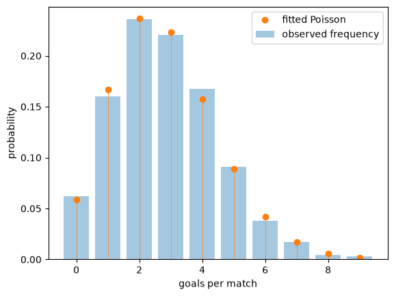
Fig. 21.7 Goals per match and fitted Poisson#
The fit is good.
This is a well-known empirical regularity, and the reason for it is worth stating: goals are rare events, arising at a roughly constant rate over the course of a match, and largely independently of each other.
Those are exactly the conditions under which the Poisson distribution arises.
21.7. When the normal fails#
When we compared classes above, we took a list of candidate classes, fitted each one to the data, and kept the one with the smallest KS distance.
Such a procedure always produces a winner.
But it is important to remember that the winner can still be a poor description of the data, since it is only the best of the candidates we happened to try.
The remedy is to look at the fit as well as ranking it, and, when it fails, to let the way it fails suggest a better candidate.
Let’s see how this works, returning to the monthly returns on Amazon shares that we studied in Observed Distributions.
data = yf.download('AMZN', '2000-1-1', '2024-1-1', interval='1mo')
prices = data['Close']['AMZN']
returns = prices.pct_change().dropna() * 100
Returns take both signs, so of our continuous classes only the normal is available.
Let’s look at the Q-Q plot.
fig, ax = plt.subplots()
qq_plot(returns, fit_normal(returns), ax)
plt.show()
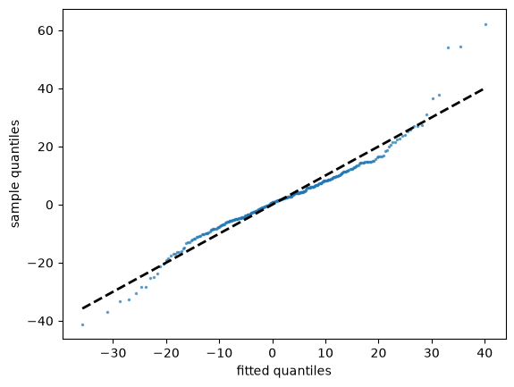
Fig. 21.8 Amazon returns against a fitted normal#
This is the S-shape described above: the smallest returns are more negative than the fitted normal predicts, and the largest are more positive.
In other words, both tails of the data are heavier than the normal distribution allows.
Now let’s compute the KS statistic.
ks_statistic(returns, fit_normal(returns))
0.06799509014059524
Taken on its own, the number looks unremarkable.
Note
Values of \(D\) should not be compared across data sets of different size.
Even when the fitted distribution is exactly right, \(D\) shrinks as \(n\) grows, so a small value from a small sample means less than the same value from a large one.
The point here is not that \(D\) is smaller or larger than some earlier number, but that it gives no hint of the trouble that the Q-Q plot displays so plainly.
This illustrates the second warning above.
The normal distribution describes the middle of the return data reasonably well, and that is the region the KS statistic looks at.
The failure is in the tails, and the tails are precisely what a study of asset returns cares about, since they contain the large losses.
The lesson is that a single summary number is never a substitute for looking at the data.
21.7.1. A heavier-tailed candidate#
The Q-Q plot did more than tell us that the normal distribution fails.
It told us how it fails: the data have heavier tails than the fitted normal.
That points to a remedy, which is to try a class with heavier tails.
One such class is the Student’s t distributions, which are symmetric and bell-shaped like the normal but carry an additional parameter \(\nu > 0\), called the degrees of freedom, governing the weight in the tails.
Small values of \(\nu\) produce heavy tails, and as \(\nu \to \infty\) the distribution converges to the normal.
Shifting and scaling gives us a three-parameter class, so the method of moments calls for three moments.
The first two are the mean and the variance, as before.
The third moment is of no use here, because every member of the class is symmetric and hence has zero skewness, whatever \(\nu\) may be.
So we use the fourth instead, exploiting the fact that a member of this class has excess kurtosis \(6/(\nu - 4)\) when \(\nu > 4\).
Matching it to the sample excess kurtosis \(\hat K\) gives
and the variance \(\nu \sigma^2 / (\nu - 2)\) then pins down the scale.
def fit_t(sample):
    m, s = sample.mean(), sample.std()
    ν = 4 + 6 / scipy.stats.kurtosis(sample)
    return scipy.stats.t(df=ν, loc=m, scale=s * np.sqrt((ν - 2) / ν))

u = fit_t(returns)
u.kwds['df']
5.804215121689082
Let’s see whether it does better.
fig, ax = plt.subplots()
qq_plot(returns, u, ax)
plt.show()
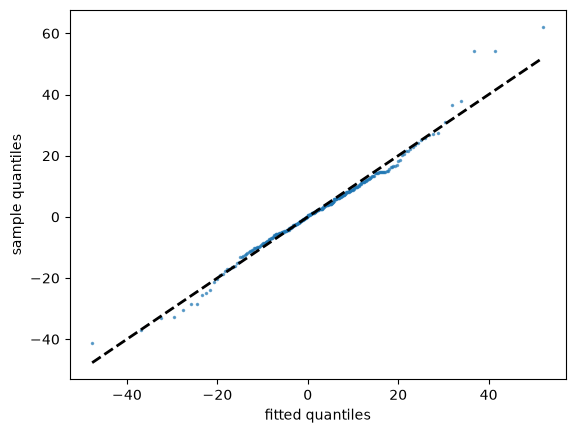
Fig. 21.9 Amazon returns against a fitted t#
The systematic S-shape is gone.
Apart from a handful of the most extreme observations, where the fitted quantiles now overshoot slightly, the points sit close to the line.
The KS distance falls by about 40% as well.
ks_statistic(returns, u)
0.04114771740390599
So it is not true that nothing fits these data — we simply had not yet tried a class that allows for heavy tails.
Note
We should not put too much weight on the fitted value of \(\nu\).
Our estimate of it came from the sample kurtosis, which is a fourth moment, and higher moments are estimated poorly precisely when the tails are heavy.
Fitting this distribution by maximum likelihood instead, as we do in Maximum Likelihood Estimation, gives \(\nu \approx 3.6\) rather than \(5.8\), and a smaller KS distance again.
The method of moments is simple and general, but it is not always the best use of the data.
Distributions with heavy tails, and the ways in which they change how we think about risk, are the subject of Heavy-Tailed Distributions.
21.8. Exercises#
The next data set records every earthquake of magnitude 5 and above in the region around Japan between 2000 and 2024, as reported by the US Geological Survey.
url = ('https://github.com/QuantEcon/data-lectures/raw/main/'
       'lectures/japan_earthquakes.csv')
quakes = pd.read_csv(url)
quakes.head()
| time | magnitude | latitude | longitude | depth_km | |
|---|---|---|---|---|---|
| 0 | 2000-01-09T04:02:23.680Z | 5.4 | 37.280 | 141.515 | 56.0 |
| 1 | 2000-01-10T16:40:42.240Z | 5.7 | 27.350 | 139.979 | 453.2 |
| 2 | 2000-01-11T23:43:56.450Z | 5.1 | 40.498 | 122.994 | 10.0 |
| 3 | 2000-01-13T18:52:12.030Z | 5.2 | 44.393 | 149.492 | 48.9 |
| 4 | 2000-01-23T07:40:04.900Z | 5.5 | 30.239 | 130.768 | 42.9 |
Exercise 21.1
Earthquakes are often modeled as arriving randomly and independently at some constant rate.
If that is true, then the time between successive earthquakes is exponentially distributed.
Using the data above, compute the time in days between successive earthquakes, fit an exponential distribution by the method of moments, and assess the fit.
(The exponential distribution has one parameter \(\lambda\) and mean \(1/\lambda\).)
Does the model hold up?
Solution
Here is one solution.
times = pd.to_datetime(quakes['time'], format='ISO8601')
gaps = times.diff().dropna().dt.total_seconds() / (60 * 60 * 24)

u = scipy.stats.expon(scale=gaps.mean())

fig, ax = plt.subplots()
qq_plot(gaps, u, ax)
plt.show()
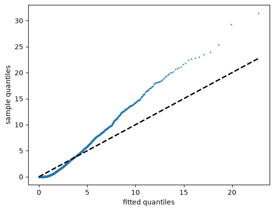
The fit fails badly, with the largest gaps far longer than the exponential distribution predicts.
A second diagnostic makes the problem clearer.
For the exponential distribution the standard deviation equals the mean.
gaps.mean(), gaps.std()
(2.5645754636399616, 3.765224536996305)
The standard deviation is around half again the mean, so the data are much more variable than the model allows.
The reason is that earthquakes are not independent.
Large earthquakes are followed by aftershocks, so events arrive in clusters, with long quiet periods in between.
We can see this directly by counting events per month.
monthly = times.dt.to_period('M').value_counts().sort_index()
monthly.mean(), monthly.var()
/tmp/ipykernel_6963/2771413300.py:1: UserWarning: Converting to PeriodArray/Index representation will drop timezone information.
  monthly = times.dt.to_period('M').value_counts().sort_index()
(11.856666666666667, 1148.9793868450386)
If the arrivals were Poisson, these two numbers would be roughly equal.
Instead the variance is many times the mean, which is the signature of clustering.
This connects to the discussion of independence in Observed Distributions: a sample tells us about a distribution only when its observations bring new information, and an aftershock tells us mostly what the main shock already did.
Exercise 21.2
In Observed Distributions we found that the ages at death in Japan have sample skewness of about \(-1.6\).
Fit a normal distribution to that data by the method of moments and use a Q-Q plot to display the failure.
Which way do the points bend, and why?
Solution
Here is one solution.
url = ('https://github.com/QuantEcon/data-lectures/raw/main/'
       'lectures/japan_deaths_by_age.csv')
deaths = pd.read_csv(url)
age_at_death = np.repeat(deaths['age'], deaths['deaths_total'])

fig, ax = plt.subplots()
qq_plot(age_at_death, fit_normal(age_at_death), ax)
plt.show()
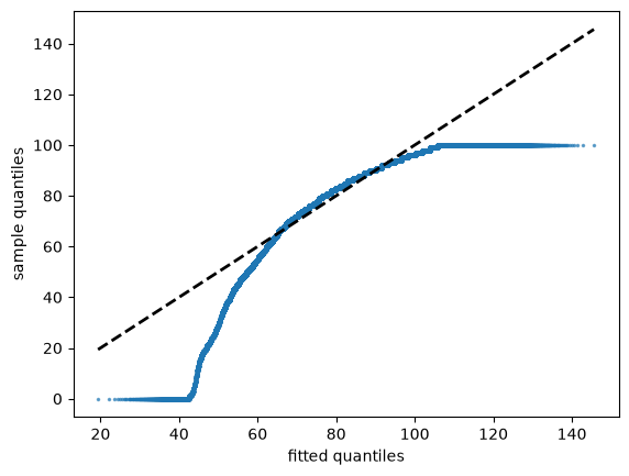
The points bend downwards, which is the mirror image of the house price figure.
At the left-hand end the sample quantiles fall well below the fitted ones, because the data have a long left tail of deaths at young ages that the normal distribution cannot reproduce.
The figure also shows a second, unrelated problem: the points run flat along \(y = 100\) at the right-hand end.
That is the “100 and over” category discussed in Observed Distributions, which caps every age at 100.
A Q-Q plot displays such recording conventions very clearly, since they show up as flat segments where many observations share a single value.